 Polaris
Typography
Typography helps establish hierarchy and communicate important content by creating clear visual patterns.

Working with typography

1. Make it scannable
Keep related text aligned and closer together to create visual groupings. For most languages, the the majority of text should be left-aligned.
2. Adjust text based on device size and distance from the merchant
Because small screens are often at an arm's distance, we can decrease the size of larger headings and increase the size of important body text.
3. Create visual hierarchy
Pair font weight, size, and color together to create hierarchy. Use a lighter color or font-size to de-emphasize secondary content.
Essentials for designing with type
When designing with type, we can use a combination of font size, weight, color, and space to ensure a strong hierarchy and scannability of a page. By understanding the fundamentals, you’ll be able to better apply type to the UI.
Using the bounding box
The bounding box is the vertical height of the text and is defined by the text’s line-height. The value of the line-height is critical to make sure text aligns to the 4px grid. Refer to individual type styles for specified heights.

Using the baseline
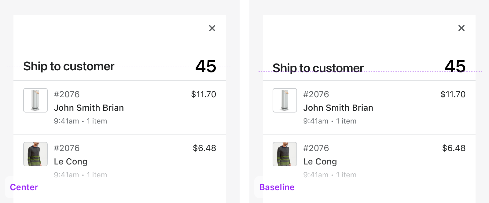
The baseline is the imaginary line that letters rest on. Align text horizontally to the baseline for a simple clean look.
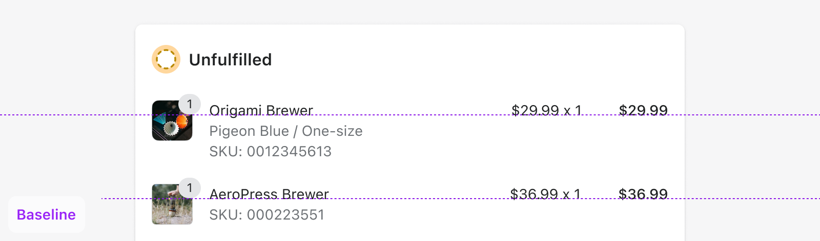
There are situations where it makes sense to have multiple text sizes on a single line to establish hierarchy of elements. Aligning to the text’s baseline instead of center gives a more harmonious look.
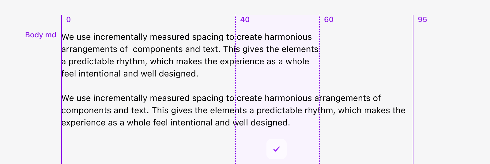
Line length
Line length describes the width of the content. For longer body text, the recommended line length is between 40 to 60 characters.
Color
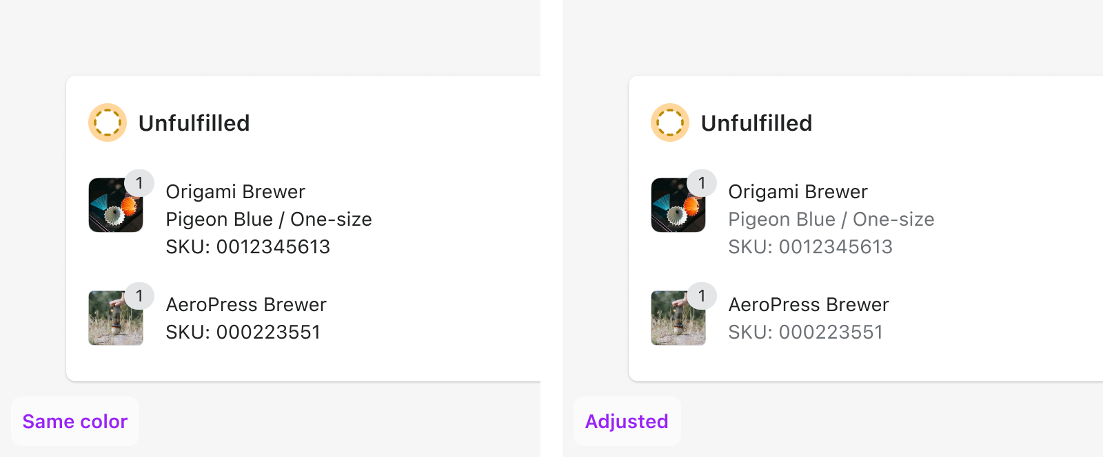
Color can be used to add contrast and reinforce the hierarchy between text.
For example, one way to distinguish between a title and a subtitle is to apply --p-text-color to the title, and --p-text-subdued to the subtitle. Using a lighter color for secondary information provides contrast between the text and helps reinforce hierarchy even when the text is the same size and weight.
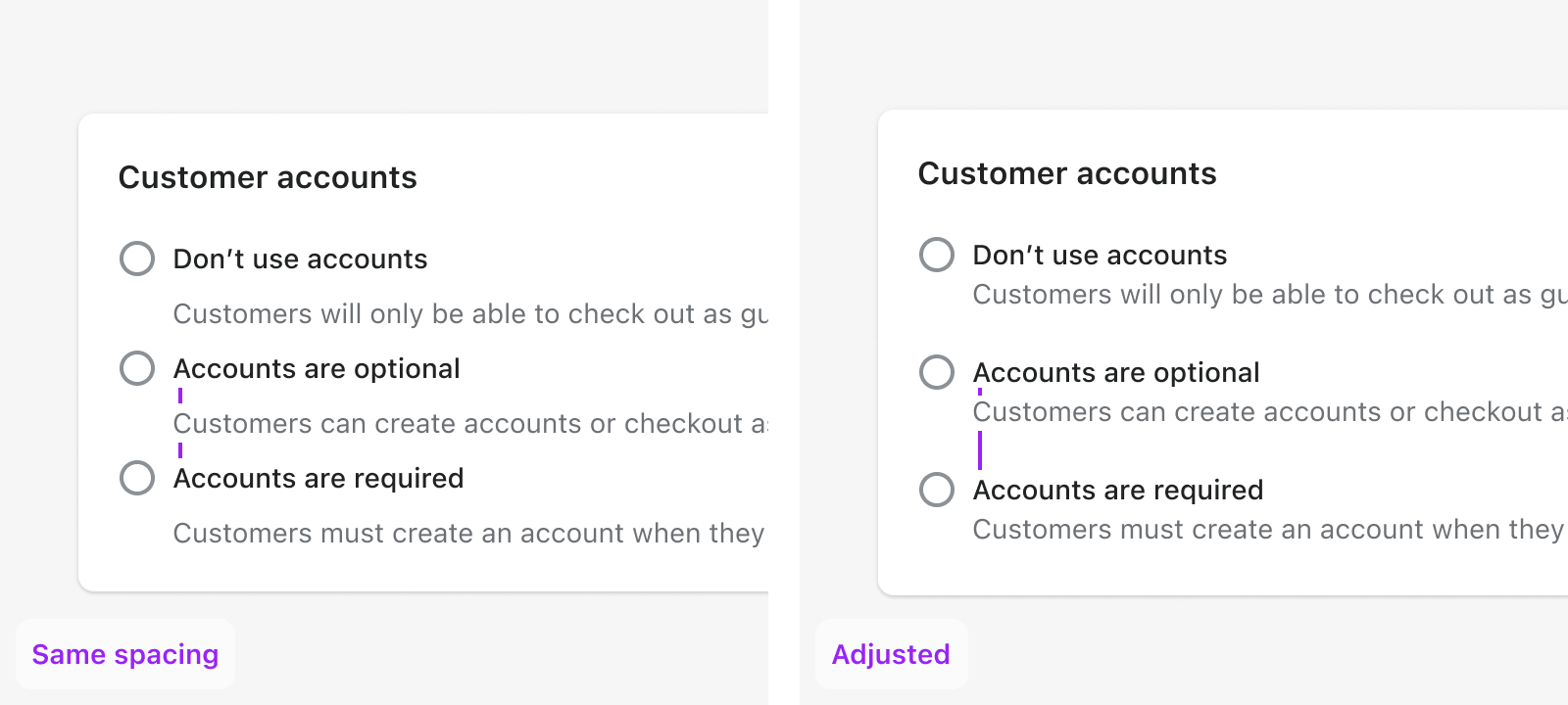
Space
We can help merchants navigate the UI by grouping related information together. One way to do this is to use space to create relationships between elements on a page.
Ambiguous spacing can cause confusion and make it hard to understand the content.
Font sizes
All font sizes have a ratio of 1.2, known as the major third type scale. This means that each size is multiplied or divided by 1.2 from the previous size, starting with the base size, and rounded to a multiple of 4px.
| Token | px value | rem value |
|---|---|---|
p-font-size-700 | 40 | 2.5 |
p-font-size-600 | 32 | 2 |
p-font-size-500 | 28 | 1.75 |
p-font-size-400 | 24 | 1.5 |
p-font-size-300 | 20 | 1.25 |
p-font-size-200 | 16 | 1 |
p-font-size-100 | 14 | 0.875 |
p-font-size-75 | 12 | 0.75 |
Type styles
Polaris type styles are grouped into two categories: heading and body. Each has a default set of variants along with a set of options to allow for flexibility and a wide range of applications within the user interface. They use one scale, so they can be applied to any screen size.
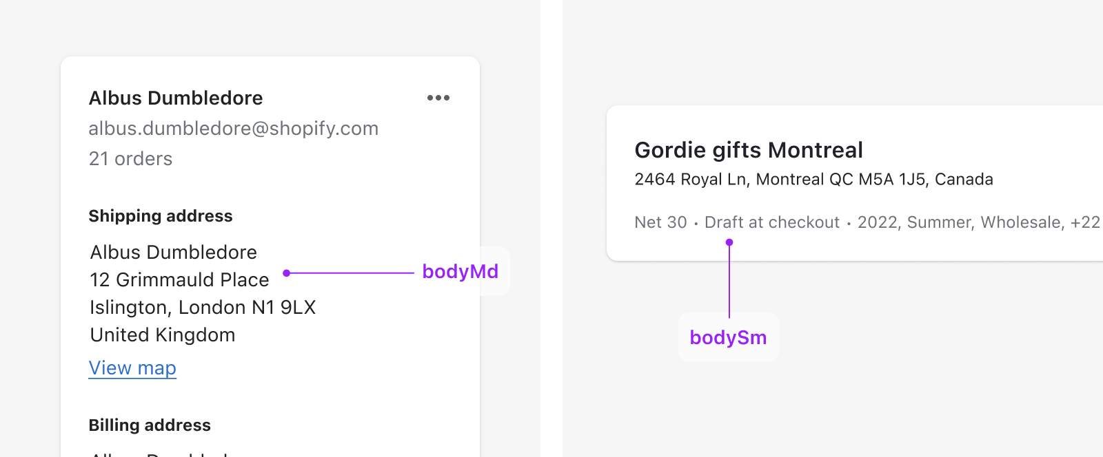
Body styles
Body styles are used within components and blocks of text.
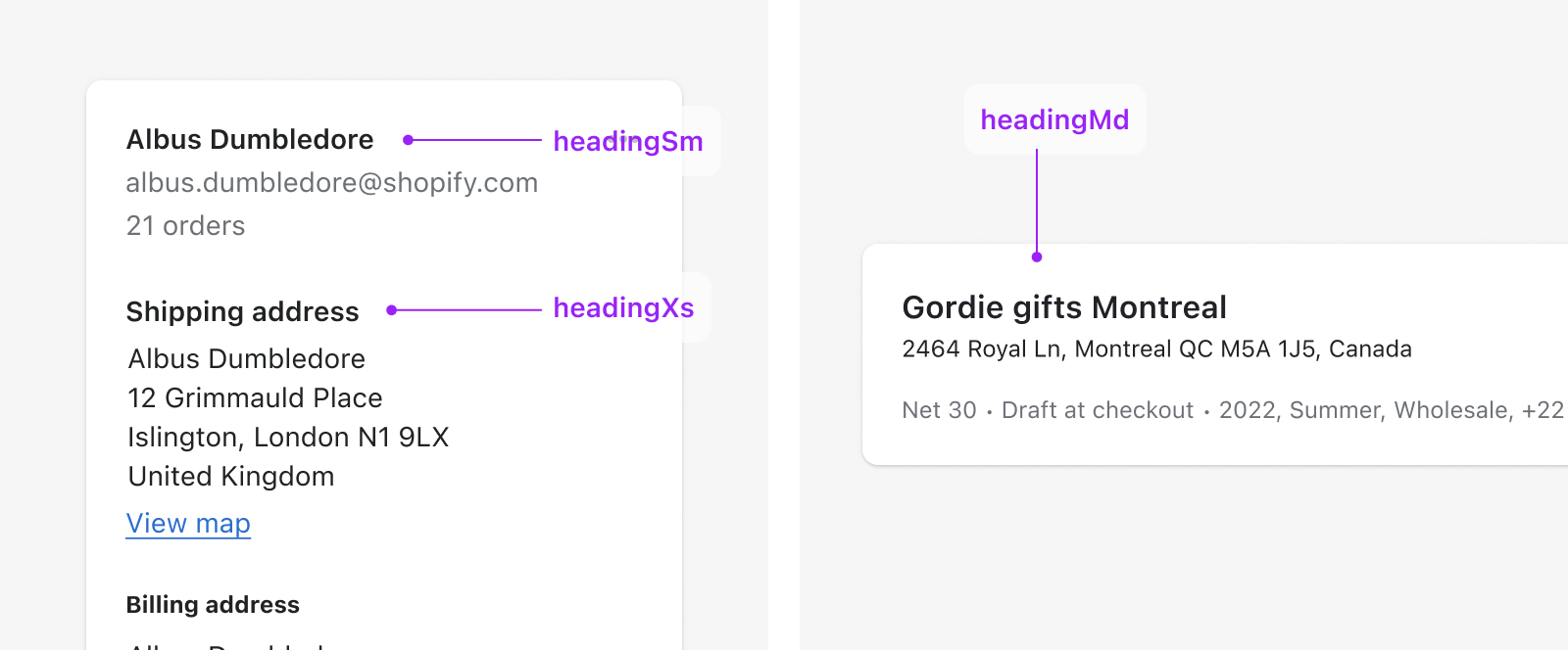
Heading styles
Heading styles are used to create various levels of hierarchy on the page. These styles range in size and weight. Using a blend of the two can help distinguish content and guide merchants through the page.
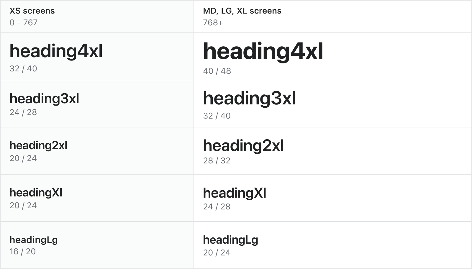
headingXl - heading4xl styles are typically used for numerals and key moments in the merchant’s journey. As the largest text on the screen, use these styles sparingly within a single page. These styles should draw the merchant’s attention to important key pieces of information.
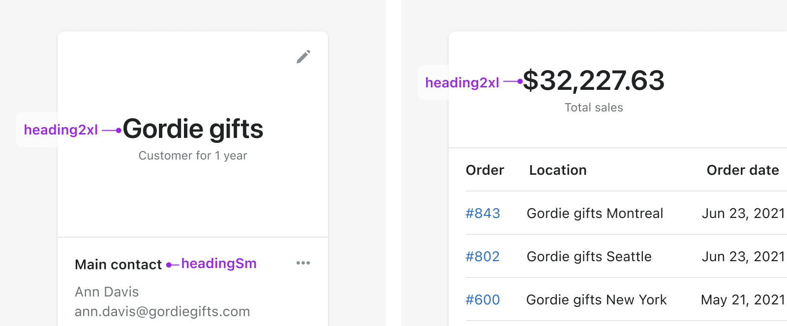
headingXs - headingLg styles are most commonly used for card, section, or page titles.
Responsive styles
Large heading styles, headingLg - heading4xl, are responsive and will change size at different breakpoints.
Small heading styles, headingXs - headingMd, and body styles will remain the same size regardless of breakpoint unless specified. You can choose to adjust the size of these styles at specific breakpoints when needed. For instance, you may need to increase the size of important body text on smaller screens.
Font stack
We use a font stack that adapts to the operating system it runs on, like macOS, iOS, Windows, Android or Linux distributions.
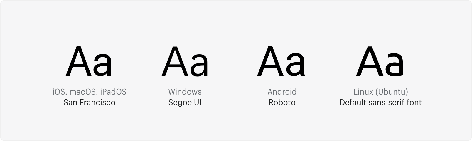
- Apple devices will display San Francisco
- Android devices will display Roboto
- Devices running Windows will display Segoe UI
- Machines running Linux will display the default sans-serif font for any running distribution
This font-stack makes sure all browsers can load platform-specific fonts:
Example-apple-system, BlinkMacSystemFont, San Francisco, Segoe UI, Roboto, Helvetica Neue, sans-serif
Add this to your CSS to preload system fonts and set up browsers for legibility:
Examplehtml {
  /* Load system fonts */
  font-family: -apple-system, BlinkMacSystemFont, San Francisco, Segoe UI,
    Roboto, Helvetica Neue, sans-serif;

  /* Make type rendering look crisper */
  -webkit-font-smoothing: antialiased;
  -moz-osx-font-smoothing: grayscale;

  /* Deactivate auto-enlargement of small text in Safari */
  text-size-adjust: 100%;

  /* Enable kerning and optional ligatures */
  text-rendering: optimizeLegibility;
}

/**
 * Form elements render using OS defaults,
 * so font-family inheritance must be specifically declared
 */
button,
input,
optgroup,
select,
textarea {
  font-family: inherit;
}
Mobile considerations
Do
- Refer to the platform’s native font scales when designing experiences for native apps
- Refer to the small-screen scale when designing experiences for mobile browsers
- Use the platform-specific component library
Do
- Use the native font scale
- Keep in mind that all UI elements containing text will be affected
- Explore additional content height, width, truncation, and line wraps