 Polaris
Colors
Our color system builds on the recognition of the Shopify brand colors to make the admin interface more usable.
Principles
Communication is key
Although we value an aesthetically pleasing use of color, we place a higher value on clear communication. Color supports the purpose of the content, communicating things like hierarchy of information, interactive states, and the difference between distinct elements.
Colors have meaning
Colors have assigned roles, which hold a specific meaning based on how they function within the interface. Defined color roles make things easy to modify and customize later. They also extend the color system so it works across any touchpoint at Shopify.
Colors follow accessibility guidelines
The color system is designed within the HSLuv color space to generate themes that meet WCAG 2.1 compliant contrast ratios. This makes things easier to find, identify, and interact with. It also makes the whole experience more accessible for merchants who are color blind or who have low vision. However you should never convey information using color alone.
Color roles
We define colors based on the role they play in the interface. There are 10 color roles, which we use to generate the values of all the color variants in the palette.
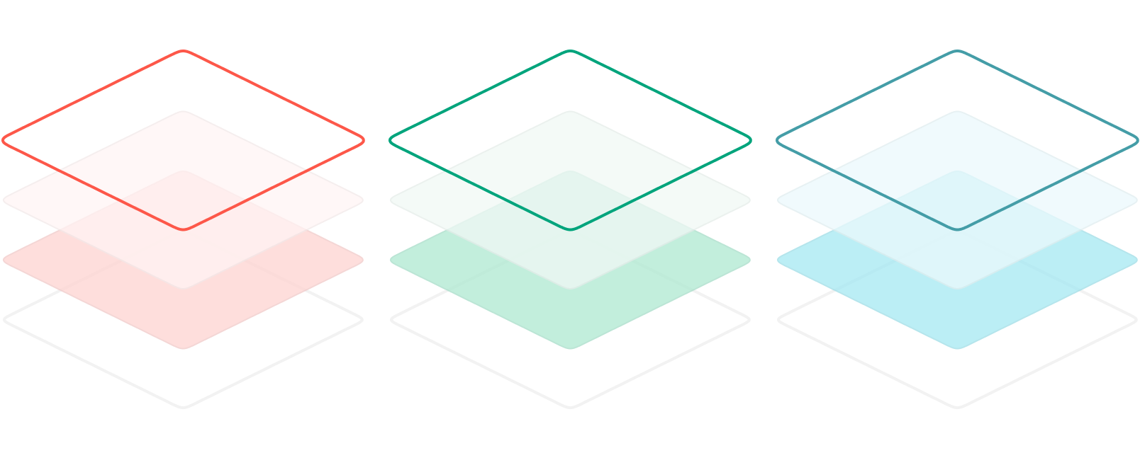
Color variants
Color variants are variables that apply color to the UI, and their values are generated from the color roles. Color variants are available as tokens.
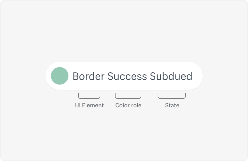
Variants share a naming pattern that references their color role, the interaction state they define, and any UI elements they’re linked to.
The color system in action
How the color roles relate to the variants, and how they’re applied across the interface.
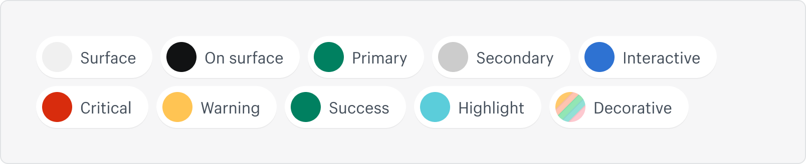
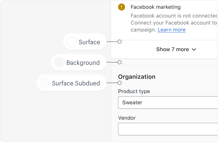
Surface
Surface colors affect surfaces of components, such as page, card, sheet, and popover.
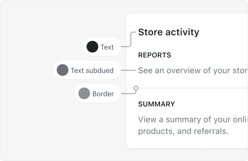
On surface
Apply on-surface colors to elements that appear on neutral surfaces, usually borders, secondary icons, and text elements.
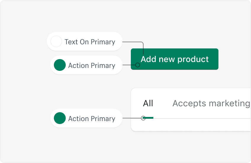
Primary
Use primary colors for primary actions like buttons, icons and text on navigation and tabs, and for the background in navigation and tab interactive states.
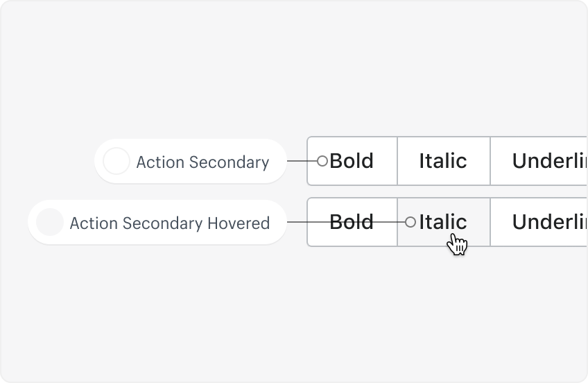
Secondary
Use secondary colors for secondary and tertiary buttons and the background of form elements.
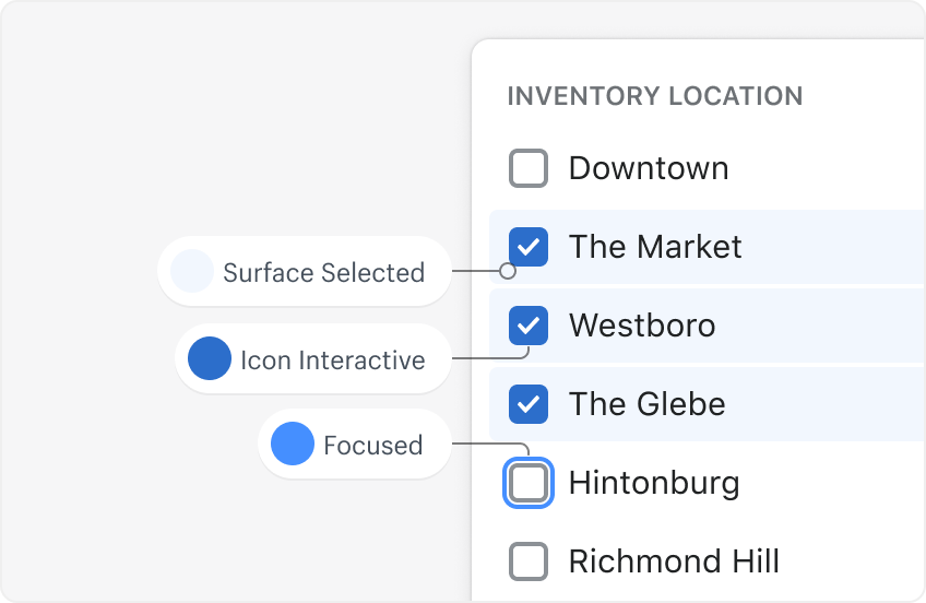
Interactive
Use interactive colors for things like links, focus indicators, and selected interactive states.
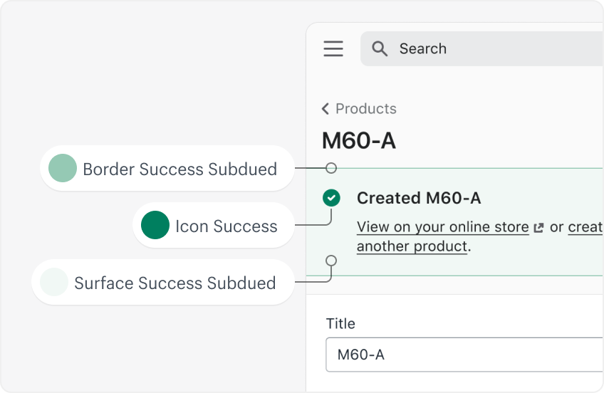
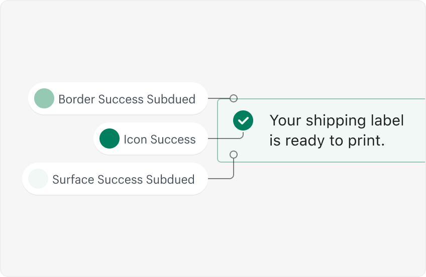
Success
Success colors indicate something positive, like the success of a merchant action or to illustrate growth.
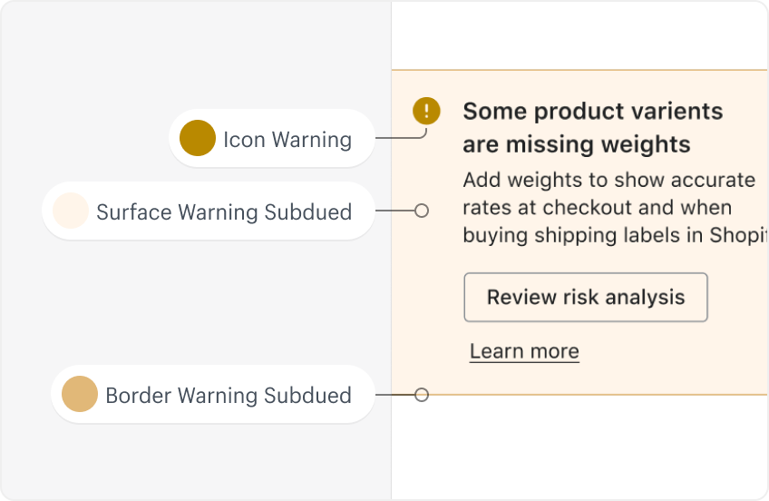
Warning
Warning colors let the merchant know they need to take action, and are applied to badges, banners, and exception lists.
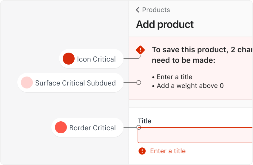
Critical
Critical colors are for destructive interactive elements, errors, and critical events that require immediate action.
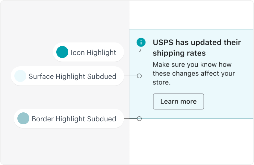
Highlight
Highlight colors indicate important elements that don’t require immediate action. They’re used with informational banners and badges, indicators that draw attention to new information, loading or progress bars, and data visualization.
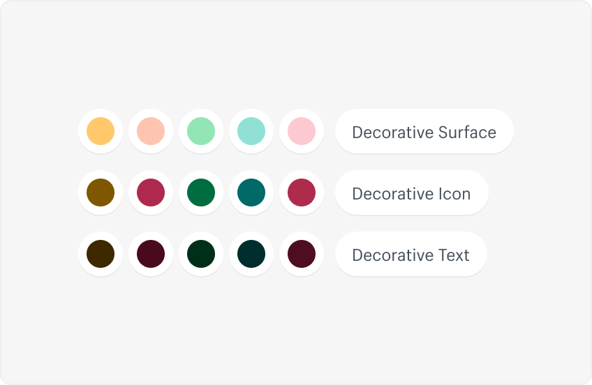
Decorative
Decorative colors are for expressive communications that assert the Shopify brand presence.