Data visualizations
Visualizations surface patterns in data, and provide immediate answers to a single, specific question.
This section outlines data visualization practices at Shopify and how to leverage them.
Data visualizations at Shopify
The data visualization process always begins with a set of data, a question, and analysis of the data to find the answer. Each visualization should focus on answering a single question about the dataset. For example, “What are my sales over time?”
By maintaining consistent styles and formats for our data visualizations, we ensure that data is presented in a truthful and accurate manner to maintain integrity with merchants.
Guidelines
Data visualization should be approached by:
Solving a problem
Have a clear question that needs to be answered. If multiple answers to multiple questions are illustrated in a visualization, it will become over complicated and hard to understand.
Testing with real data
Testing with real data will reveal the effectiveness of the visualization. Also test when there are a few data points (one or two) or many data points (100 or more).
Scaling by number of datapoints
Think about how the visualization will scale with more or fewer data points. Look out for cases where data is sparse (mostly zero) or spiky (some values are much larger than others).
Five core traits
An effective data visualization strikes the right balance between the five core traits: accuracy, intuitiveness, engagement, focus, and data granularity. It’s important to be intentional about which of these you focus on, and which are less important, in order to answer your specific question in the best way for your target audience. Understanding these traits help you choose between the many ways to visualize data by giving you a language for evaluating a visualization's effectiveness.
Accuracy
Accuracy is about how faithfully the visualization matches the original data set. How much accuracy is needed to send your message across? A high level of accuracy may not always be needed to convey a trend or a pattern.
Intuitiveness
Intuitiveness is about the ease of interpreting the visualization. Will merchants immediately understand what’s being represented, or will they need instructions? More intuitive is usually better, but sometimes it comes at the cost of flexibility.
Engagement
Engagement is about how much attention the visualization attracts at a glance. Is it the star of the show, or does it sit in the background? More engagement is not always better—sometimes the best visualization is one that plays a supporting role.
Focus
Focus is about how merchants’ attention is directed. Is one pattern or trend surfaced more prominently than others, or are there several trends that are given equal weight? Highly focused visualizations decrease cognitive overload, but restrict the breadth of the message you are able to convey.
Data Granularity
Data granularity is about the level of detail of the data set presented in the visualization. More granular means more data points, and possibly more cognitive processing, but less granular is less detailed. The right level of data granularity depends entirely on the specific question you’re trying to answer and the audience you’re communicating to.
Axis and labelling conventions
All standard charts that show quantitative data have 2 axes that should be labeled for clarity.
- Labelling should be outside and separate from the data area. This ensures the user understands the range of the data without taking focus away from the data.
- Ensure that all labels are clear and accurate in what they represent. Use simple and short language.
Granular guidelines
Axis lines
Axis lines should be used as a guideline to show quantitative data, yet be unobtrusive.
Do
Ensure axis lines only appear where the data appears.
Don’t
Use bleeding axis lines to the edge of the screen.
Skipping labels
Labelling the tick marks on both the y-axis and x-axis helps the visualization become more clear in what it represents.
Do
Skip labels in regular intervals.
Don’t
Try to squeeze all labels together.
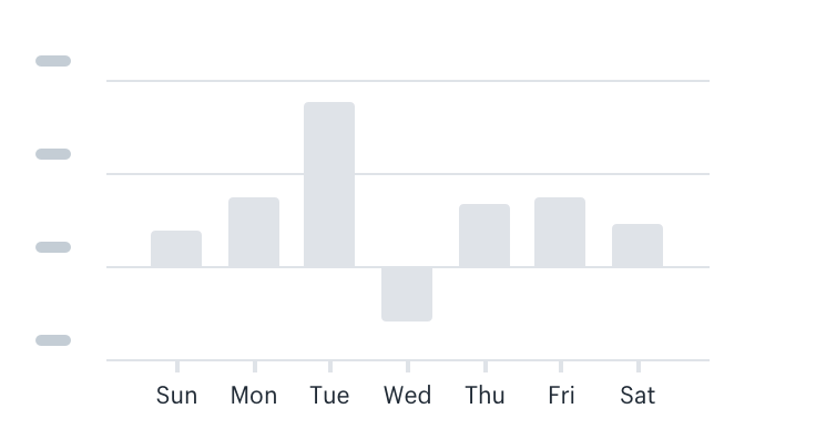
X-axis Abbreviations
Shopify uses standard abbreviations for months and weekdays in order to reduce clutter in visualizations.
- Use 12 hour format for time, with lowercase letters (12am, 6pm)
- Use the first three letters for days of the week (Sun, Mon)
- Use the first three letters for months (Feb, Mar)
- For specific days, use the format ‘day + month’ (10 Apr, 11 Apr)
- For specific months, use the format month + year (Apr 2011, May 2017)
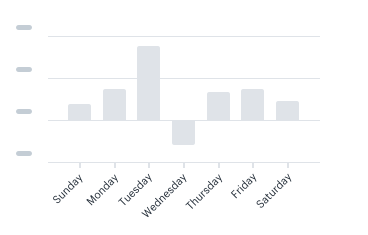
Do
Use standard abbreviations for labeling.
Don’t
Slant labels to make them fit.
Y-Axis Abbreviations
Shopify uses standard monetary abbreviations for the y-axis to reduce clutter.
Do
Abbreviate using ‘k’ for thousand, ‘b’ for billion.
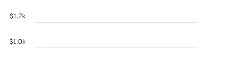
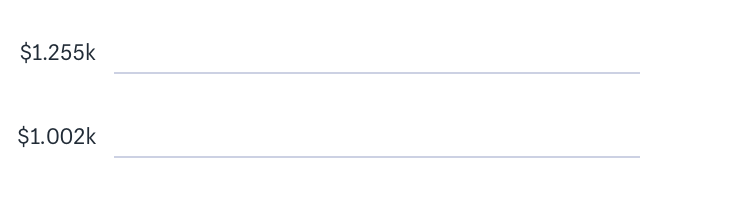
Don’t
Go over 3 numeric characters, 1 decimal, or 1 letter.
X-axis Labelling conventions
Labels should be clear and concise.
Do
Center all labels on the bar and the tick mark.
Don’t
Use decimals on the x-axis labels.
Y-axis Labelling conventions
Labels should be clear and concise.
Do
Left align labels and keep them above y-axis lines.
Color palettes
Color in data visualization has a very specific meaning. The data visualization color palette provides specific colors that can be used alone or in a group, depending on the intent.
Single data series
Use when there is a single data series. For example, a bar chart, column chart, or a single line chart.
Single comparison to past
This is used when the data set is being compared to to its past values. For example, total sales by month, this year, compared to last year. In this case, the current value will be purple and the past value will be grey.
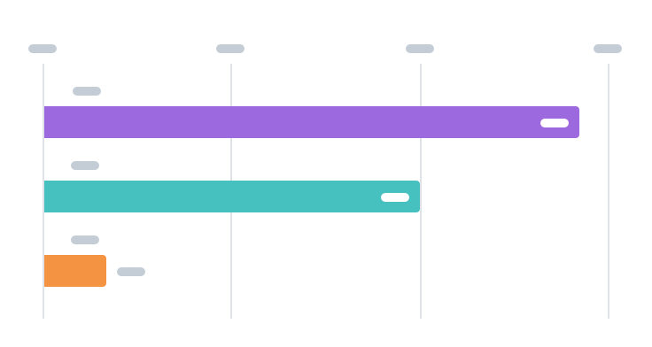
Multiseries data
Used when there are multiple data sets to compare. For example, a multiseries line chart. Go down the list as the number of datasets increase.
Biased
Used when certain data need is displayed in a negative or positive light. For example, showing positive or negative change relative to a reference value.
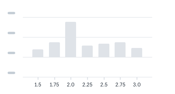
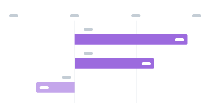
Horizontal bar charts
Bar charts are used for comparing discrete categories. Use a bar chart when there is a constraint to the number of data points that can appear on the visualization, otherwise it becomes hard to scale.
Best used for
Showing discrete categories of data, like {products} vs {sales}.
Don’t use
When the number of data points can exceed 6. In this case, use a table.
Bar chart labels
Label each bar with what it’s displaying, as well as the value. For more best practices, visit axis and label conventions.
Do
Include a label on each bar. If the bar is too small, include it outside of the bar.
Do
Include a label on top of each bar to display what data it’s showing.
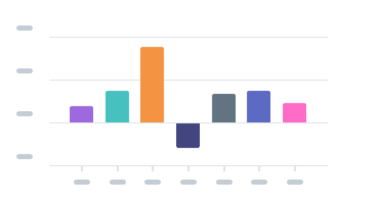
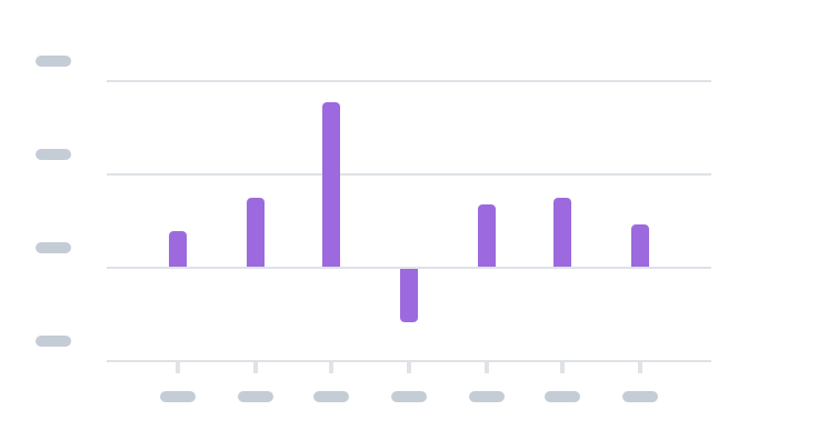
Color
Use one color for all bars.
Do
Give negative bars 60% opacity.
Don’t
Use multiple colors for the bars.
Bar positioning
Make sure the bars are proportional in width, roughly twice the size of the space between the bars.
Do
Make the width of each bar about twice as wide as the space between them.
Don’t
Make the bars too skinny.
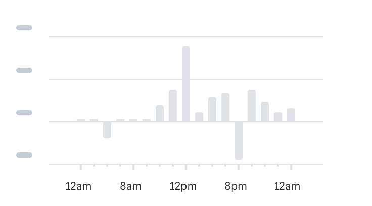
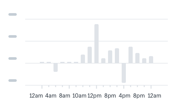
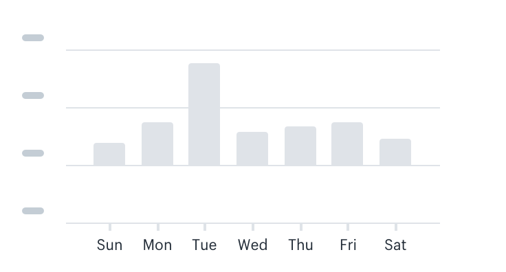
Vertical column charts
Column charts are used to show change over time, trends, and individual data points. Use column charts for when the number of data points is fewer than 30, or else use a line chart.
Best used for
- Showing continuous data like sales per hour, or orders per month
- Showing smaller granularities of time (hourly, daily, weekly, and monthly)
Don’t use
When the number of data points can exceed 31. In this case, use a line chart.
Color
All bars should be the same color.
Do
Use one color for all bars.
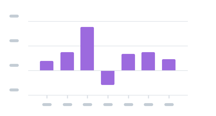
Don’t
Use multiple colors for the bars.
Bar positioning
Make sure the bars are proportional in width, roughly twice the size of the space between the bars.
Do
Make the width of each bar about twice as wide as the space between them.

Don’t
Make the bars too skinny.
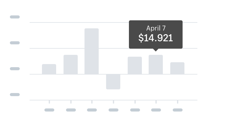
Interactivity
Include some interactivity on the bars upon hover since users will be looking at individual data points. The top line of the tooltip should follow x-axis abbreviation and labelling guidelines, while the bottom line tooltip should follow y-axis abbreviation and labelling guidelines.
Do
Include tooltips for x-axis and y-axis values.
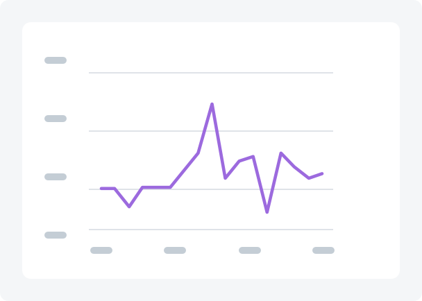
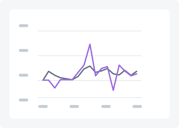
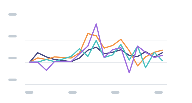
Line charts
A line chart is created by connecting a series of data points together with a line. Line charts are good to show change over time, comparisons, and trends. Use line charts when the number of data points is more than 30.
Best used for
- Showing continuous data like sales or orders over time
- Showing larger granularities of time (yearly, or quarterly)
- Spotting overall trends and shapes of data
Axis and labelling
Set up the chart area using the axis and labelling guidelines
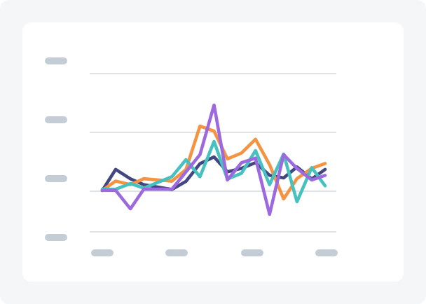
Multiline charts
Line graphs work well when multiple datasets need to be compared. Use the color palette to select colors.
Do
Use contrasting color and include a legend.
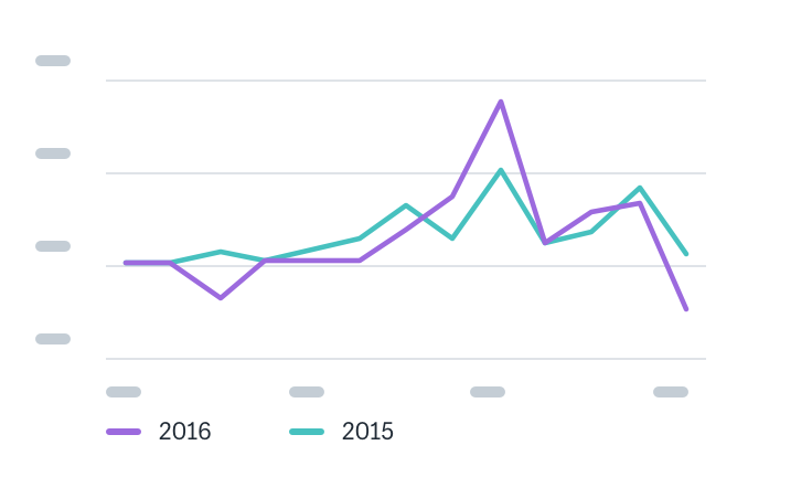
Don’t
Use more than 4 lines.
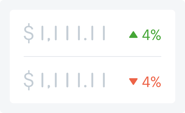
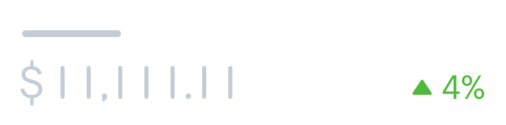
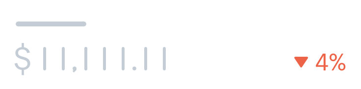
Display metrics
A display metric is a quantifiable measure that is used to track and display the status of a specific process. Examples include a sum, an average, or a movement in a positive or negative direction.
Best used for
Showing a single value with a base unit.
Units
Metrics should be paired with their base unit in close proximity to the number. Use concise and clear language for metrics.
Scope
Metrics should be scoped to indicate the timeline of the data.
Do
Include a dimension of time to scope the value.

Movement
If needed, consider including a comparison indicator, such as comparison to the previous time or average.
Do
Use green for positive movement.
Use red for negative movement.
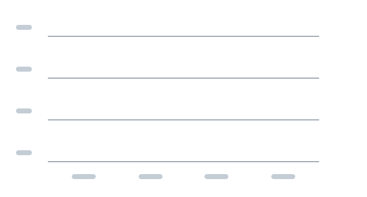
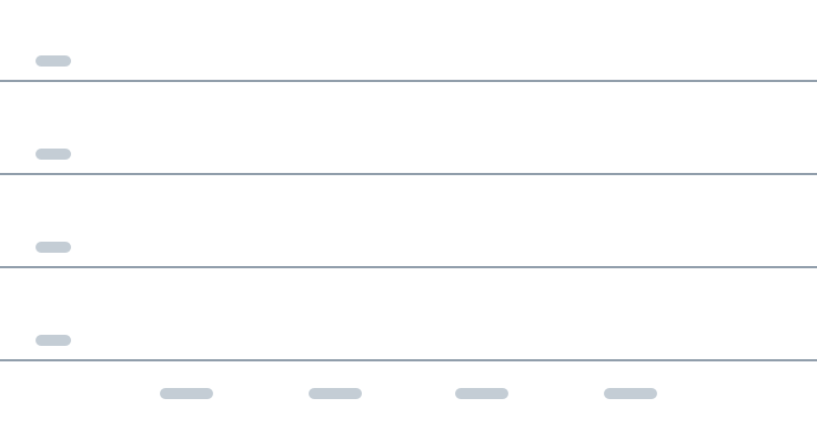
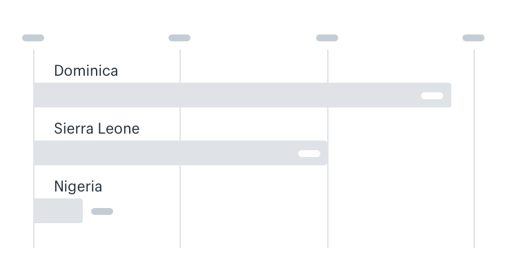
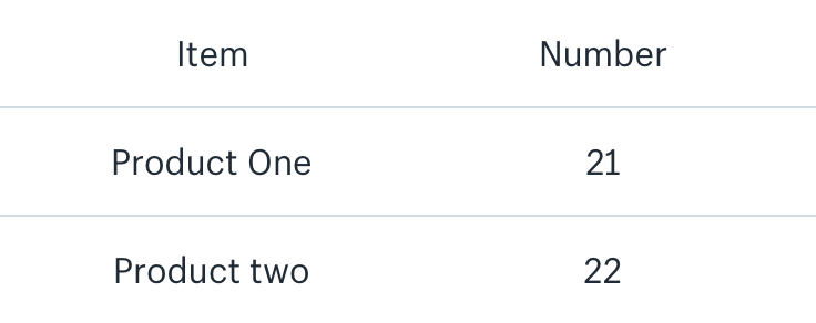
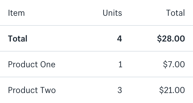
Tables
A table is a good way to showcase a large amount of information which has a variety of columns and data to show for each entity. A table should be used when multiple metrics and categories need to be presented together, and accurate lookup of the data values is more important that showing patterns in the data.
Best used for
- Showing large amounts of discrete data with many variables
- Showing values across multiple categories and measures
- Allowing for filtering and ordering when comparison is not a priority
Alignment
Consistent vertical alignment is essential for fast visual comparison between values in a table.
Do
Left align non-numeric values and right align numeric values.
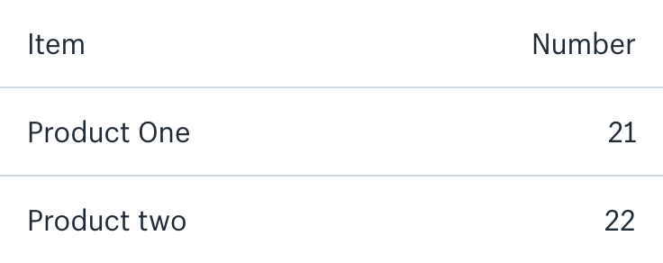
Don’t
Center column headers.
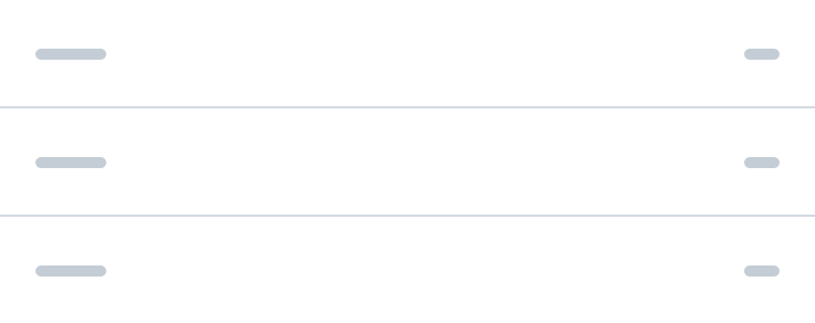
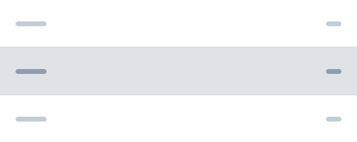
Separation
In order to reduce clutter and non-data ink, we prefer to subtly separate each row.
Do
Use light lines to indicate separation between rows.
Don’t
Highlight every other row to indicate separation.
Totals
Totals allow merchants to understand the data holistically and should be easy to find.
Do
Place totals as the first row beneath the headers, and bold the text.
Accessibility
An important part of designing clear visualizations is making data accessible to everyone.
Provide options
Merchants with vision issues might have trouble understanding visual presentations of data, even with assistive software.
Merchants with dexterity or motor issues might have trouble using interactive visualizations that depend on fine motor control.
Others might simply have trouble understanding data presented in a chart or graph.
To support the needs of different merchants, always provide multiple formats for data visualizations.
Do
Let merchants access their data in multiple formats. For charts and graphs, it’s often helpful to offer the same content in a data table that’s either on the same page or on a related page that’s easy to discover.
Don’t
Provide data visualizations in only one format.
Use of color
Color is critical for visualization, but can cause issues for merchants with color blindness and low vision. Color should be used in a way that supports the interpretation of visual information for all merchants, including those with visual issues.
Do
Ensure that text, line, bar, and other colors have sufficient contrast against their background.
Do
Use colors that can be distinguished from each other to support merchants with different forms of color blindness.
Don’t
Require that merchants are able to see color to understand the information provided in the chart or graph.
To learn more, see guidance about accessible colors in Polaris.
Scalable vector graphics (SVGs)
<svg> and <canvas> elements are excellent tools for creating engaging, dynamic visualizations in HTML. However, they are frequently difficult to access using assistive technologies. Assistive technology users may not be able to access content in the correct order, find text equivalents for visual information, or access interactions with the keyboard.
In general, hide <svg> elements from screen readers using aria-hidden="true" and provide a separate text equivalent for the graph or chart. Although different visualizations may benefit from different treatments, try to prioritize creating a consistent experience.