 Polaris
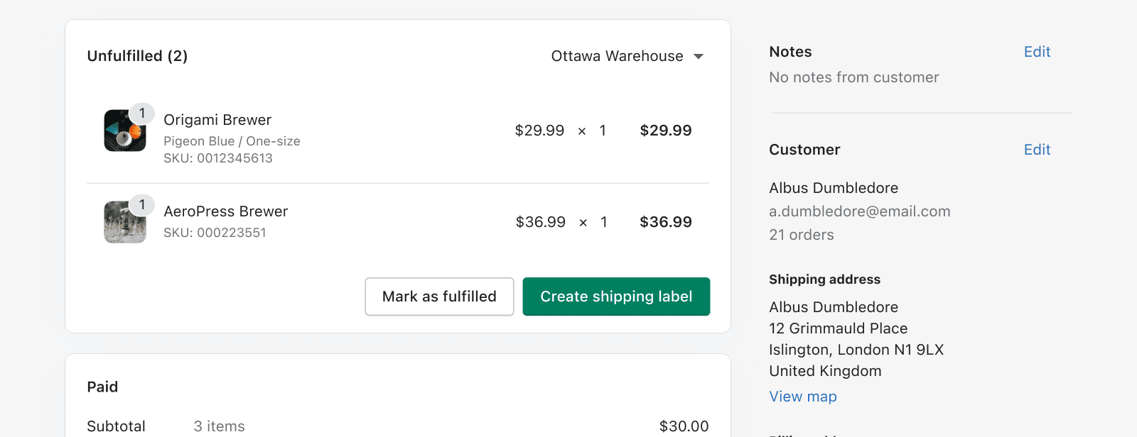
Space
Space is the distance between objects in your design. It should be used to complement the purpose of a page, by creating hierarchy and helping the content become more useful and understandable.

Spacing must...
1. Create visual groupings
The more items are related, the closer they should be to each other.
2. Complement function
Use tighter spacing for large amounts of information, use looser spacing for more focused content.
3. Be harmonious
Use Polaris space tokens in a way that is consistent with the rest of the experience.
Spacing tools
Polaris space units
All measurements used across the experience (space, width, height, etc) must reference Polaris space units to guarantee visual consistency and balance.
Space scale
| Value | Space | px value | rem value |
|---|---|---|---|
| 0 | --p-space-0 | 0 | 0 |
| 0.25 | --p-space-025 | 1 | 0.0625 |
| 0.5 | --p-space-05 | 2 | 0.125 |
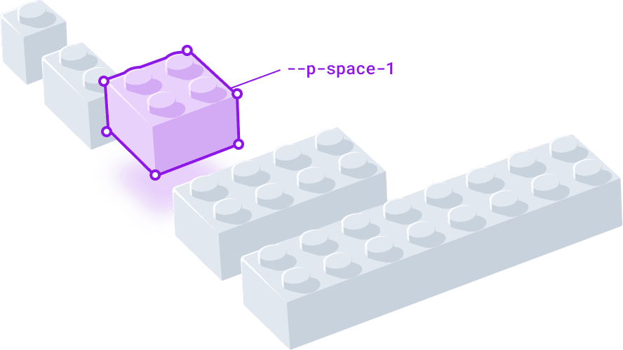
| 1 (base) | --p-space-1 | 4 | 0.25 |
| 2 | --p-space-2 | 8 | 0.5 |
| 3 | --p-space-3 | 12 | 0.75 |
| 4 | --p-space-4 | 16 | 1 |
| 5 | --p-space-5 | 20 | 1.25 |
| 6 | --p-space-6 | 24 | 1.5 |
| 8 | --p-space-8 | 32 | 2 |
| 10 | --p-space-10 | 40 | 2.5 |
| 12 | --p-space-12 | 48 | 3 |
| 16 | --p-space-16 | 64 | 4 |
| 20 | --p-space-20 | 80 | 5 |
| 24 | --p-space-24 | 96 | 6 |
| 28 | --p-space-28 | 112 | 7 |
| 32 | --p-space-32 | 128 | 8 |
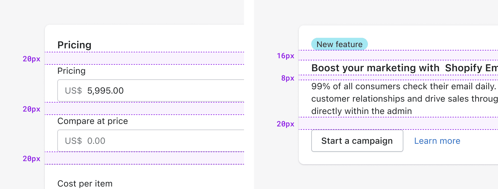
Polaris units are more dense at a small scale, and less so as dimensions increase. This is intentional to provide a good range to work with, but you must be deliberate in the units you decide to pair. We encourage designing with rhythm and contrast to achieve clear visual hierarchy. This often means skipping at least one unit in the scale when you’re pairing different spaces.
Repeating the same amount of spacing (left) and using more variation (right).
Column grid
The column grid is meant to give teams agency for page layouts, while still providing low level constraints that ensure consistent pages across the experience. This means teams should feel empowered to experiment with layout, as long as they use the column grid as a grounding element.
Breakpoints
The grid adapts to the viewport width. The amount of columns will change depending on how much space there is. This is a recommendation for how much should be displayed horizontally. Less columns means less content.
| Screen size | Columns | Margin | Gutter | Navigation |
|---|---|---|---|---|
| XS 0-489 Phones | 6 | 16 | 16 | Collapsed |
| SM 490-767 Small tablets | 6 | 16 | 16 | Collapsed |
| MD 768-1039 Tablets | 6 | 24 | 16 | Visible |
| LG 1040-1399 Laptops | 12 | 24 | 16 | Visible |
| XL 1440+ Desktops | 12 | 32 | 16 | Visible |
The grid is meant to serve as a point of reference for page level design and alignment, but this doesn’t need to apply to component level layouts.
Essentials for designing with space
Gestalt principles
The perception of any given page goes beyond the individual elements presented, and the space between them. People’s perception is heavily influenced by their own expectations and motivations. When designing, it’s key to consider that people look for patterns, and will always perceive things in their simplest form. For instance, a bunch of similar items stacked on top of each other will likely read as a list.
People look for patterns instinctively, and they lean of visual cues like:
Similarity
Grouping things based on physical appearance (shape, color, size, orientation).
Proximity
Grouping things based on distance between objects.
Continuity
Grouping things based on the way they are arranged.
Shadows inside popovers act as visual cues to indicate additional content when scrolled (left). Cards placed horizontally in a media carousel communicates related topics (right).
Closure
Grouping things that are implicitly enclosed by a larger object.
Common fate
Grouping things based on how they move.
Common Region
Grouping things that are explicitly enclosed by a larger object.
Because people perceive these instinctively, we can use them as tools to create hierarchy, visual rhythm, and guide the user's eye to what’s important.
Rhythm
Alternating between objects and space creates a pattern. Repeated patterns create visual rhythm, which can be used to effectively direct the viewer’s attention. Anything can establish rhythm: space, typography, icons, color, shape, and size.
Like in music, different types of rhythm serve a different purpose, in design there’s three worth highlighting:
Regular rhythm is predictable, which makes it a useful way to organize large sets of objects that have the same level of importance.
Flowing rhythm is organic, and it can bring a high level of scannability to something that would be otherwise a random collection of objects.
Progressive rhythm is a gradual progression, and is very effective in giving the eye a path to follow, along the progression. This is great to establish hierarchy and aid the user through a series of steps.
Rhythm plays another job in designs, it’s the norm that enables the introduction of variation and points of attention, otherwise known as contrast.
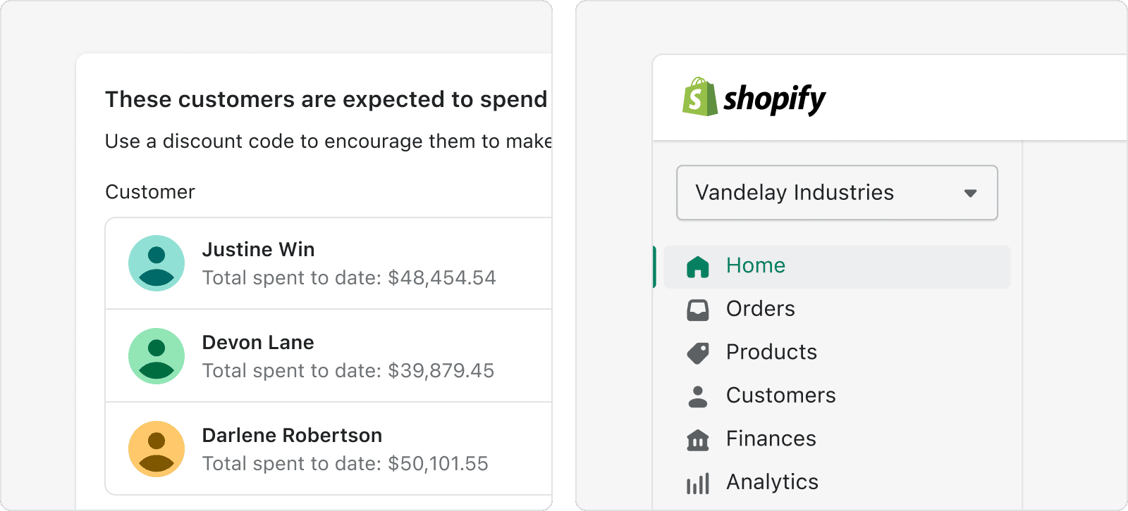
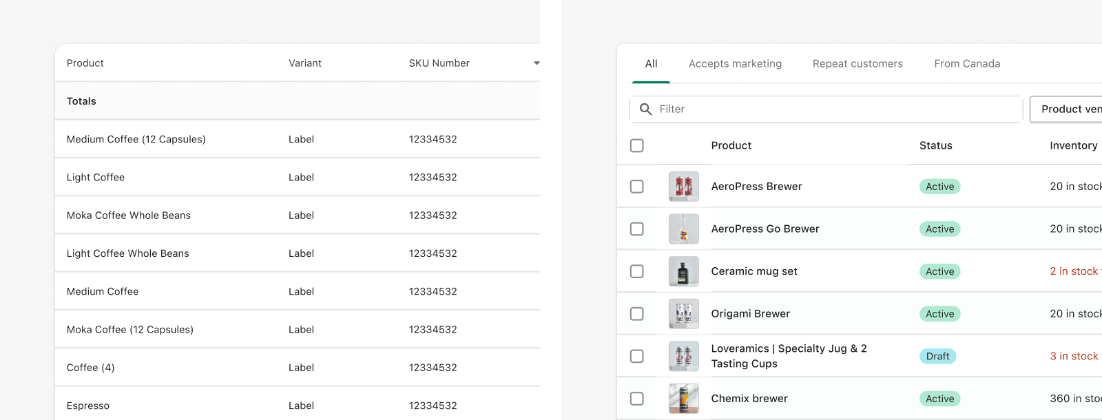
Density
The overall perception people get from the space between information as a whole is density. It can range from tight to loose, and there is a very different purpose for each end of the spectrum.
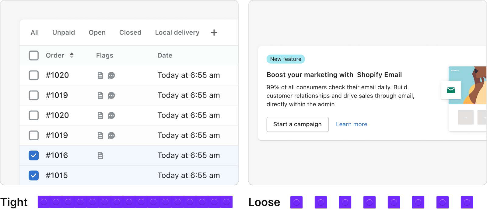
Tighter spacing (left) makes it easier to scan and comprehend large sets of data, like lists and tables. It also naturally enables one to fit more elements in a given page. Looser space (right) can help attract the user attention and make a layout feel more user-friendly.
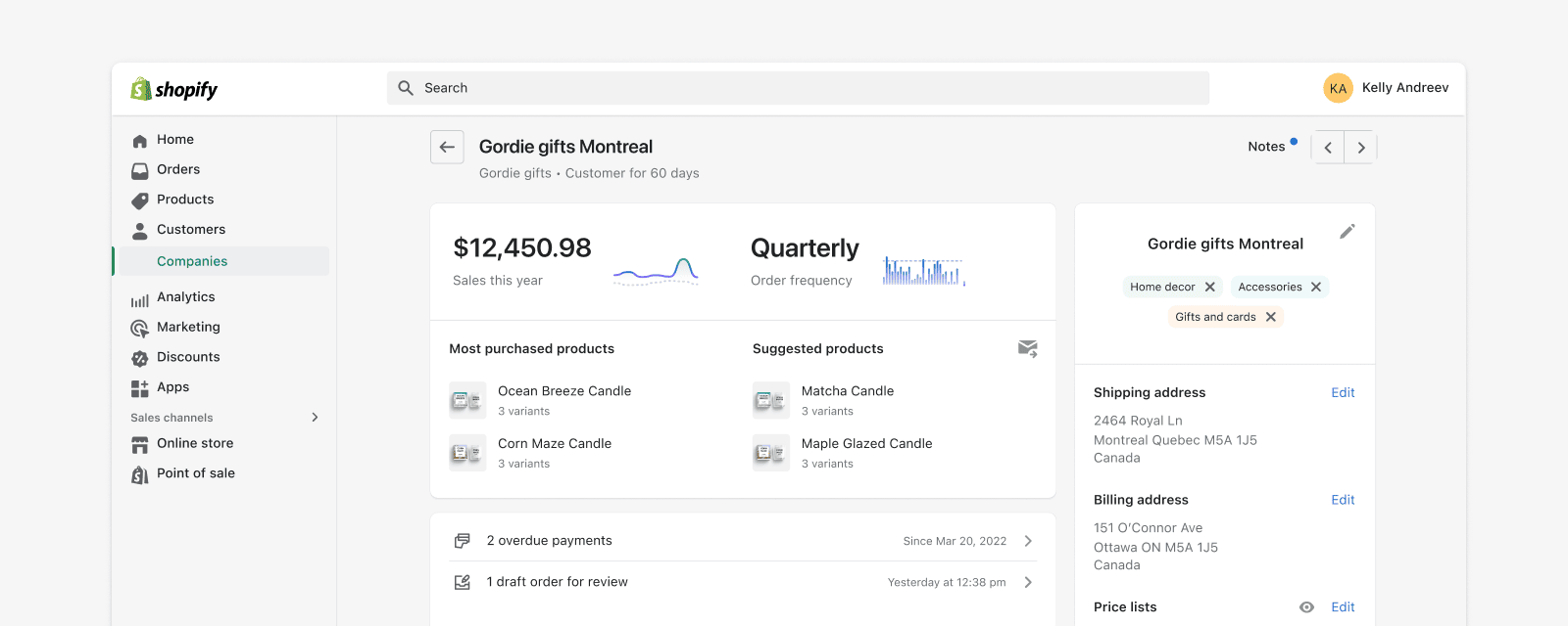
Contrast
Contrast is meant to create sticking points that help make content easy to scan, highlight important pieces of information, or just to give viewers a moment to breathe.
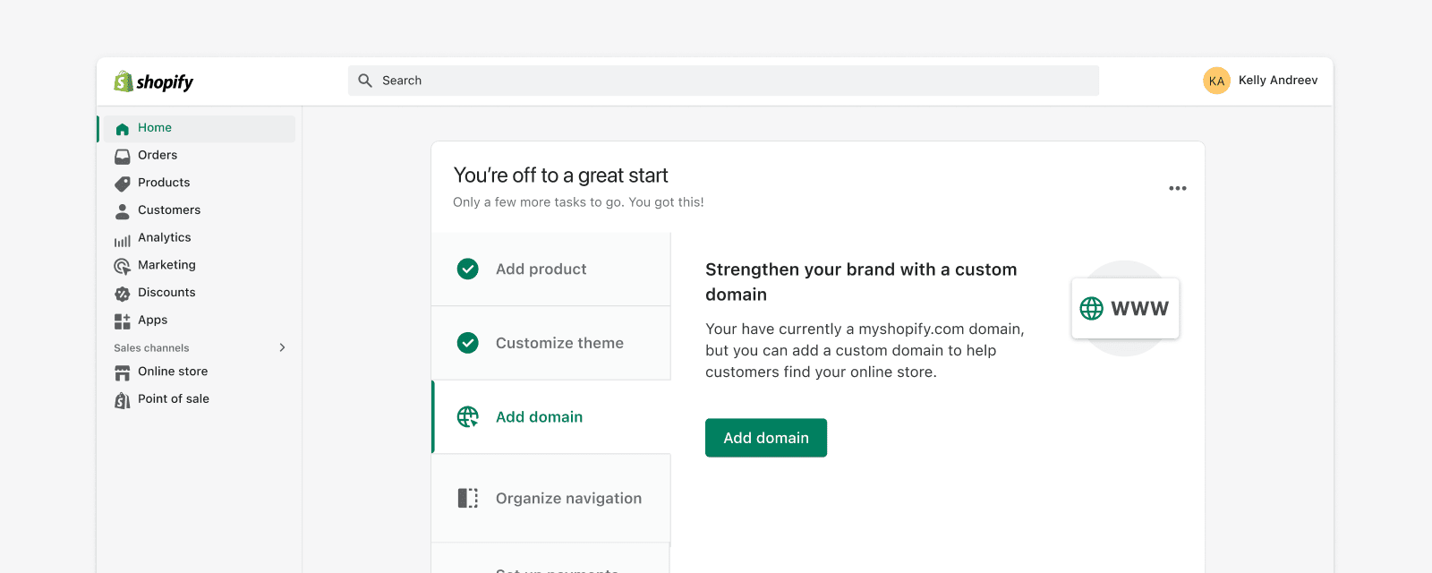
Highlights (left): Callout cards are used to encourage merchants to take an action related to a new feature or opportunity.
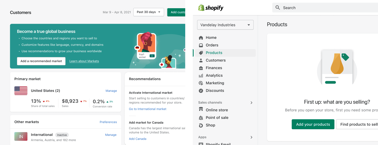
Breather moment (right): Empty states provide explanation or guidance to help merchants progress.
Contrast can play a role at very different levels, but it must be used sparingly, otherwise its effect gets diluted.
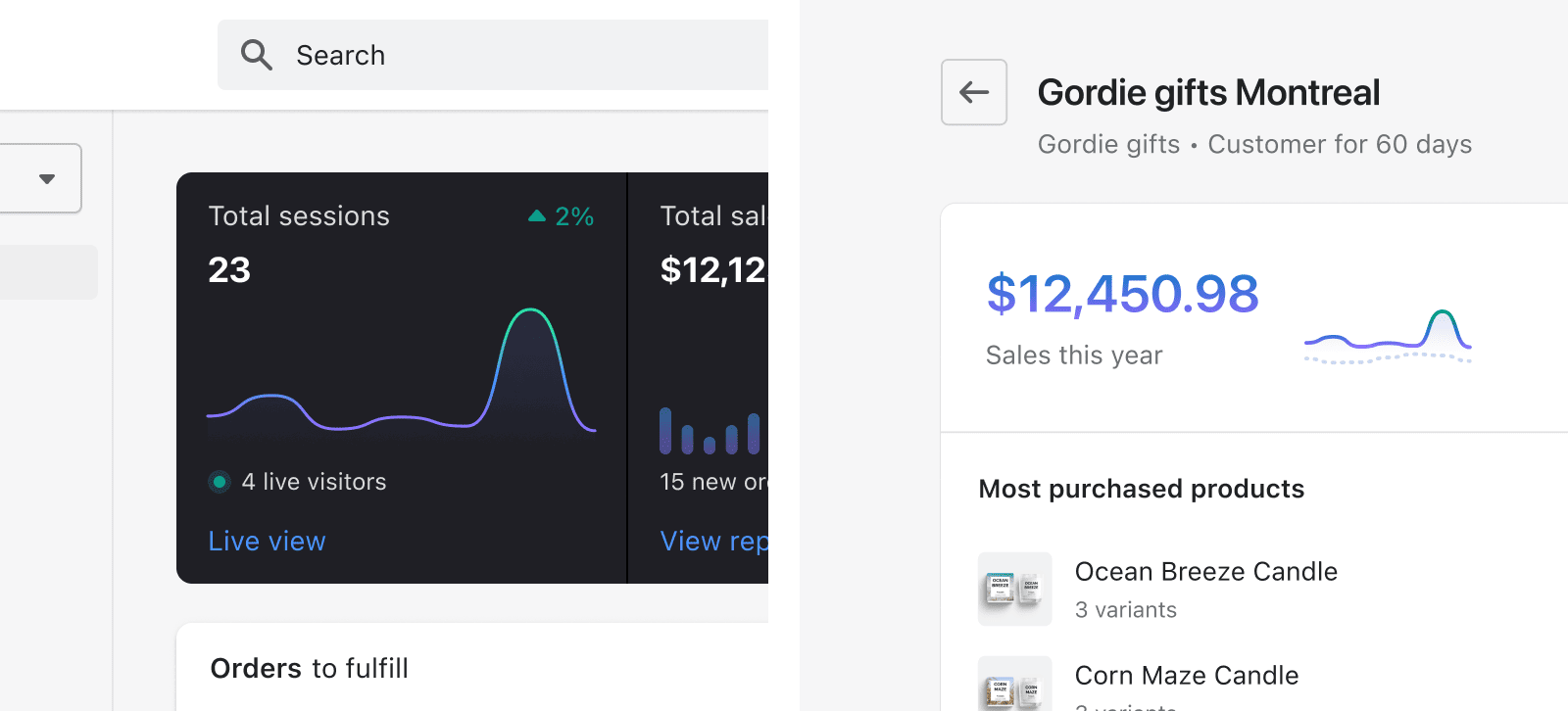
Home feed overview (left) and location profile analytics (right).
Optical adjustment
Sometimes software will say two objects are aligned, or that they have the same size, but visually they don’t feel like that. This happens because computers aren’t great at perceiving visual weight or simultaneous color contrast, so we can’t fully rely on them to create balanced compositions.
That means designers must make optical corrections, using Polaris units until the space feels balanced. Some things to keep an eye out for:
Visual weight ≠ Size
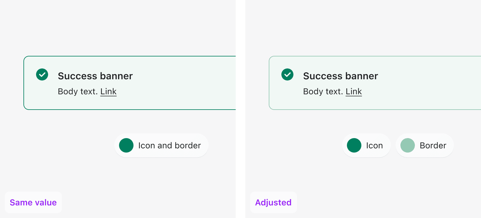
Two things can have the same size, but feel unbalanced.
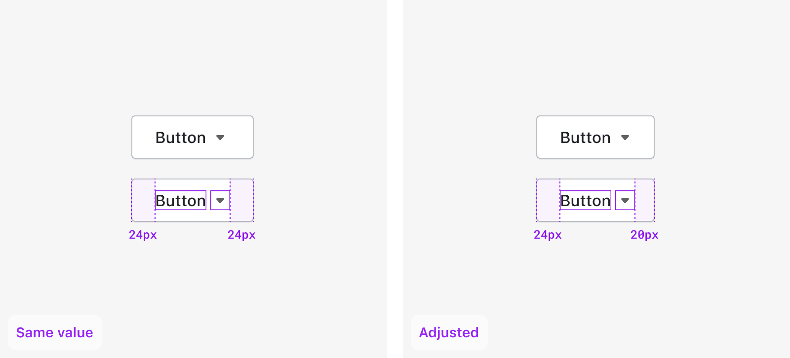
Without optical adjustment, the disclosure icon appears too far from the right edge of the button. After optical correction, the perceived spacing is more balanced.
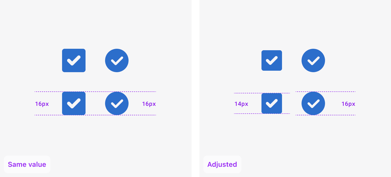
The square icon seems larger compared to the circle icon without optical adjustment, however, they in fact have the same size and diameter. The shapes look visually closer to each other after decreasing the size of the square.
Colors affect each other
Two things can have the same colour, but feel unbalanced.