 Polaris
Patterns
Design patterns help ensure consistent behavior across the Shopify admin.
Design patterns
We strive to establish and reuse the best solutions to merchant situations. Identifying and documenting design patterns is one way to make this possible.
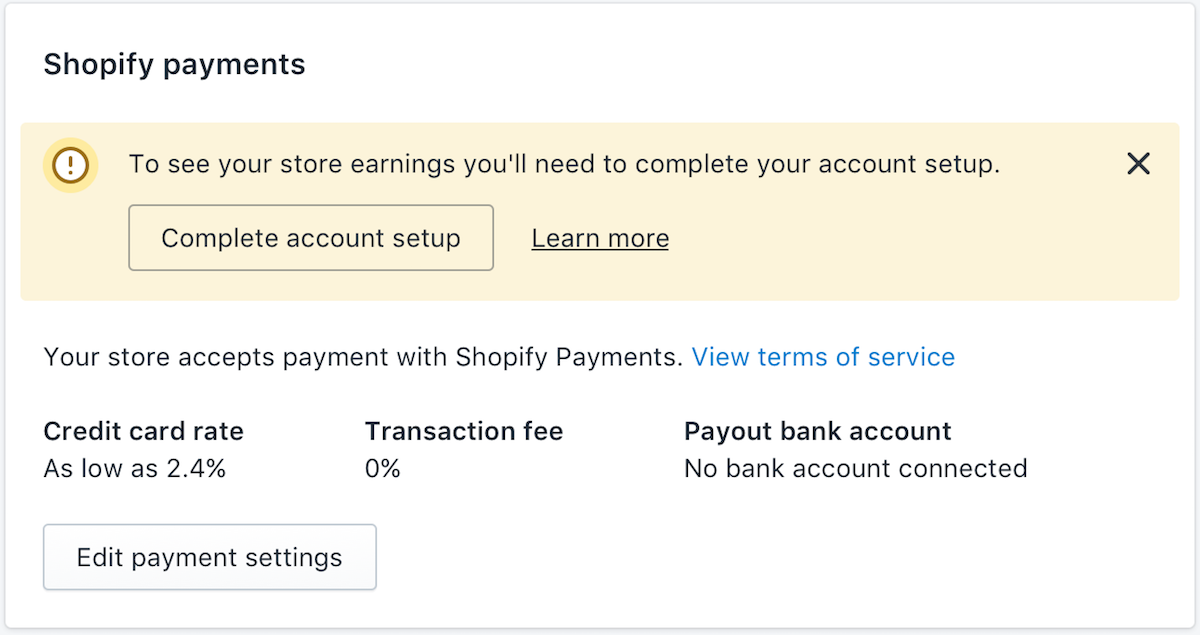
Error messages
Error messages can be scary. Make errors visible to merchants, easy to understand, and helpful.
- Error message types
- Error colors
- Anti-patterns
- Form validation
- Validate on submit
- Settings warning
- Banners
- 
- Exception lists
- Home notifications
- Admin unavailable errors
- Errors without solutions
- Voice and tone
Help content
Help content is educational text that describes interactive elements or offers information about concepts in the UI.
Loading
Navigating the Shopify admin should be fast, meaningful, and focused. Intentional loading states deliver a continuous flow for merchants.
New badge
The New badge can be used to inform merchants about the release of a feature that creates new value. It should be used sparingly and for a short time frame.
Page layouts
Layout patterns provide common ways to arrange the content of a screen.
Pickers
Picker experiences help merchants browse, find, and select from multiple options. Use them for selecting locations, customer segments, and more.
Text fields
Text fields combine the field label (the title) and the input area. Inputs can vary from typed text to URLs to date pickers.