 Polaris
Page layouts
Layout patterns provide common ways to arrange the content of a screen.
Structure of a screen
A screen is the entire user interface (UI) of an application at a given time.
A typical Polaris screen consists of several layers. The app frame makes up the outer layer. Within that are the page component and a layout component.
The layout component arranges containers like cards and banners in a way that’s responsive across all screen sizes.
App frame
The app frame is the outer UI of the application. It holds global features like top-level navigation and search.
Page component
The page component:
- Acts as a container for the content of each specific page
- Controls the horizontal margins of the content area
- Has a header containing the breadcrumb, page title, and page-level actions
Page component variations:
- Full width. Use this for wide content like lists and tables.
- Single-column. Use this narrow variant to focus the page on a single transaction, like filling out a form.
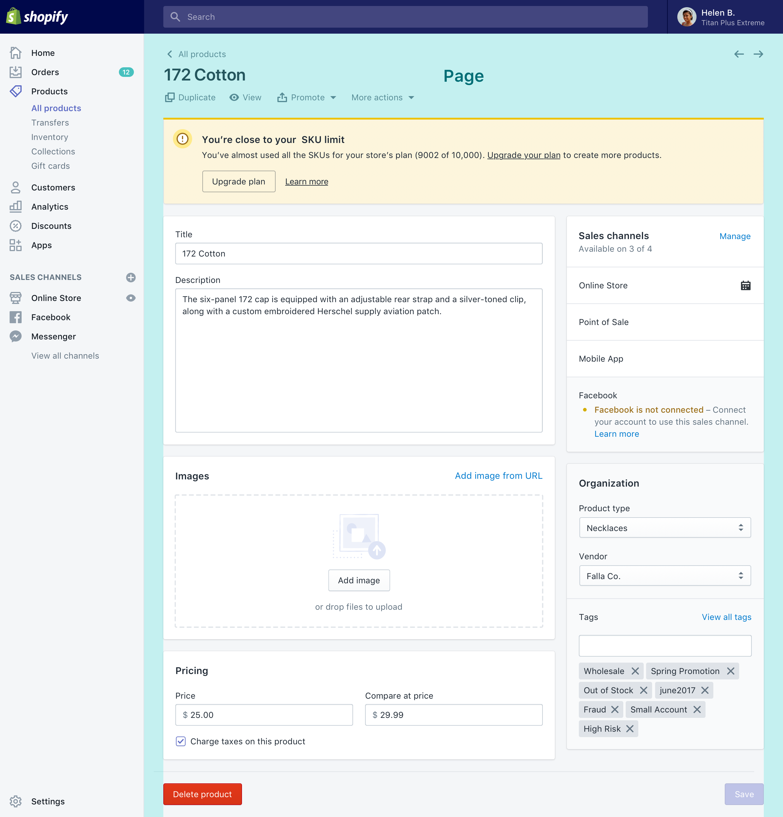
Layout component
Within the page, the layout component groups the content into sections. Sections control how the content flows into columns. Each section can be:
- Full-width
- Primary (2/3 width)
- Secondary (1/3 width)
- Annotated
Arranging content in a layout
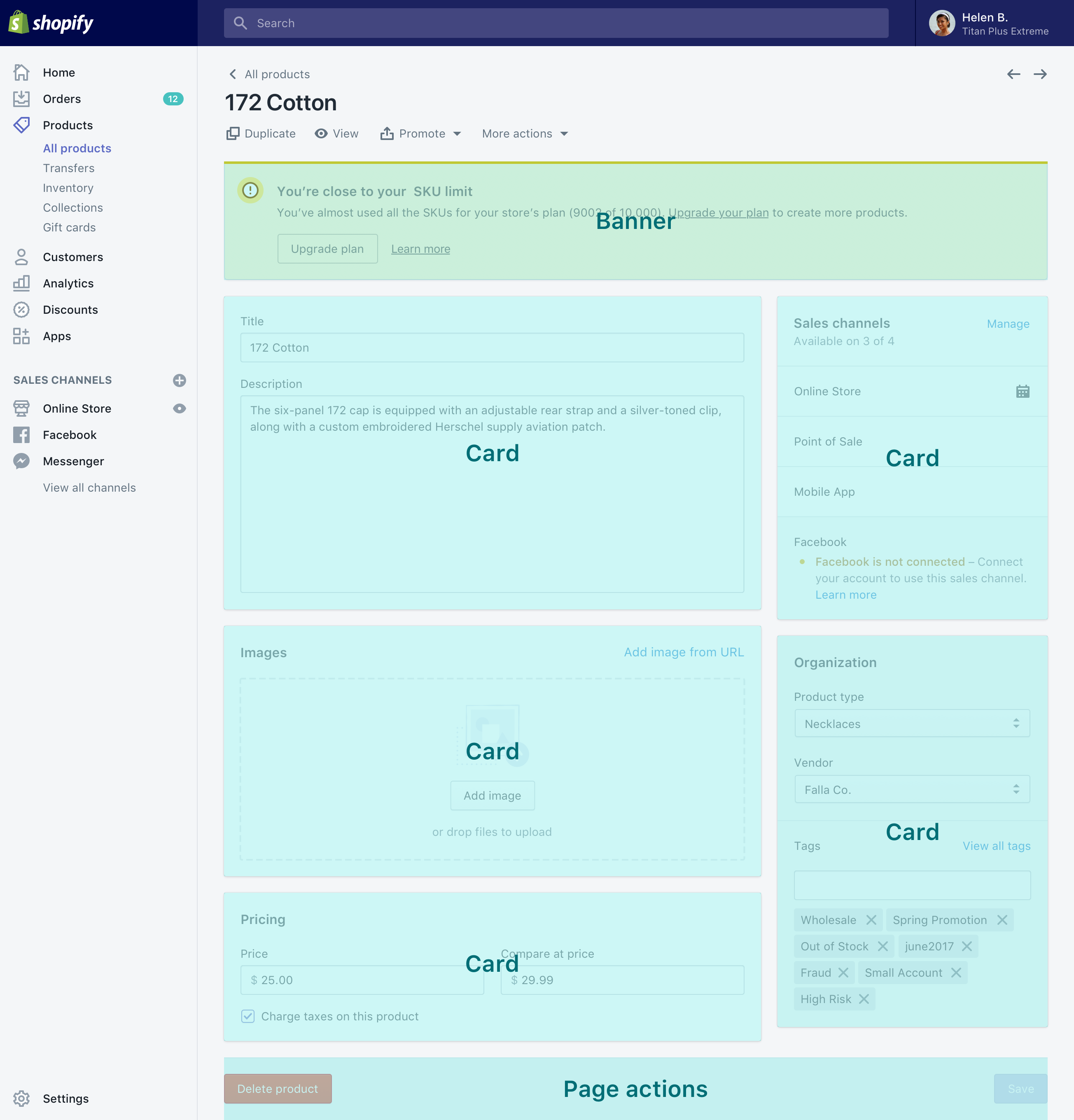
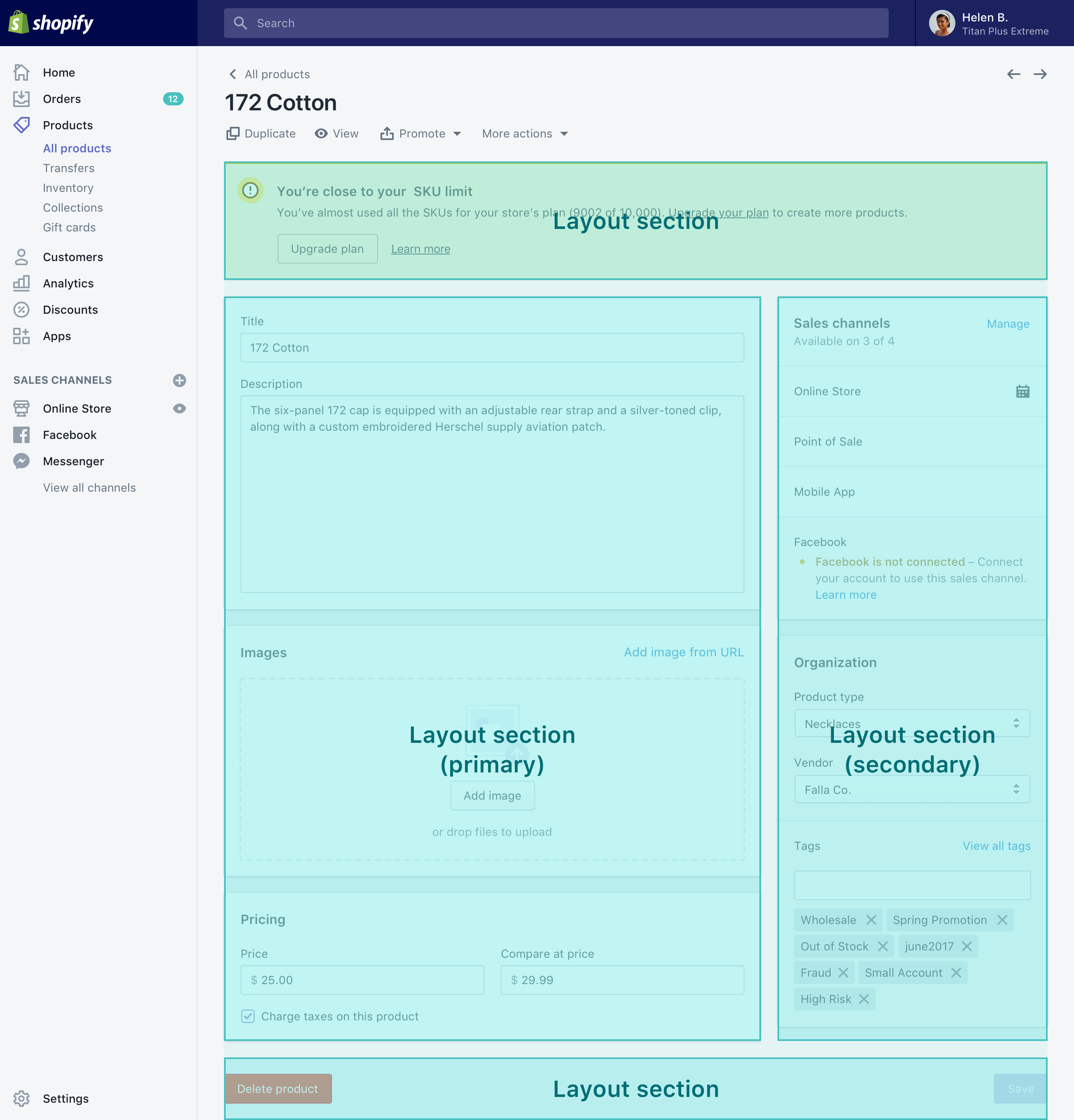
Place page-level banners in a full-width section at the top of the page.
Stack cards in sections to separate the screen’s main content into meaningful groups.
For screens that represent an individual resource like a product or order, place page actions in a full-width section at the bottom of the page.
For pages that don’t have footer actions, the footer help component can offer a link to documentation about the current screen.
Layout in a card
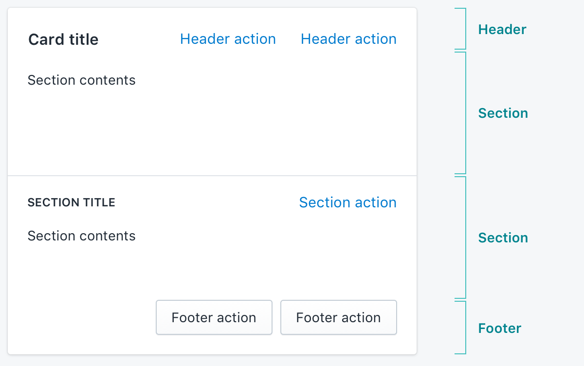
Cards have a similar structure to the page as a whole.
- Cards often have a header, with a title and card-level actions on the right.
- Cards can have footer actions.
- Complex cards can be split into sections. Card sections are automatically separated with a divider.
- Sections often have a subheader with a title on the left and section-level actions on the right.
For more details, including when to use header and footer actions, see the card component.
Specialty screen types
The structure described above applies to most screens in the Shopify admin, but other types of screens exist.
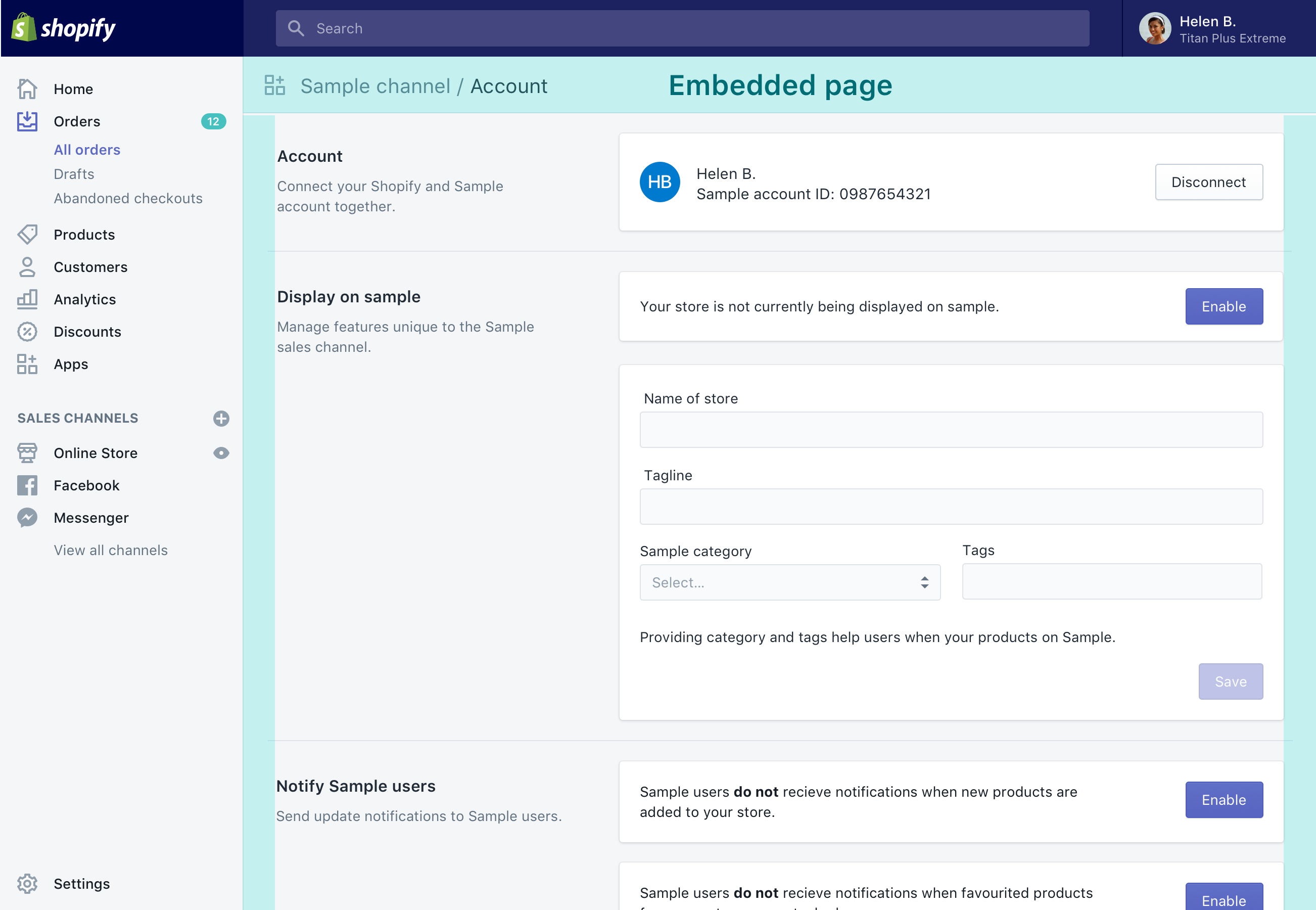
Embedded Shopify apps, including sales channels, are contained within the normal app frame. However, they display the page component differently.
Sell screens present opt-in features that require additional payment.
Immersive editors are for complex, interactive editing tasks. Immersive editors often show a live preview of what’s being worked on with tools for making changes arranged around the edges.
Standard page layouts
The following patterns describe common ways to arrange content within the app frame and below the page header.
Single column, wide
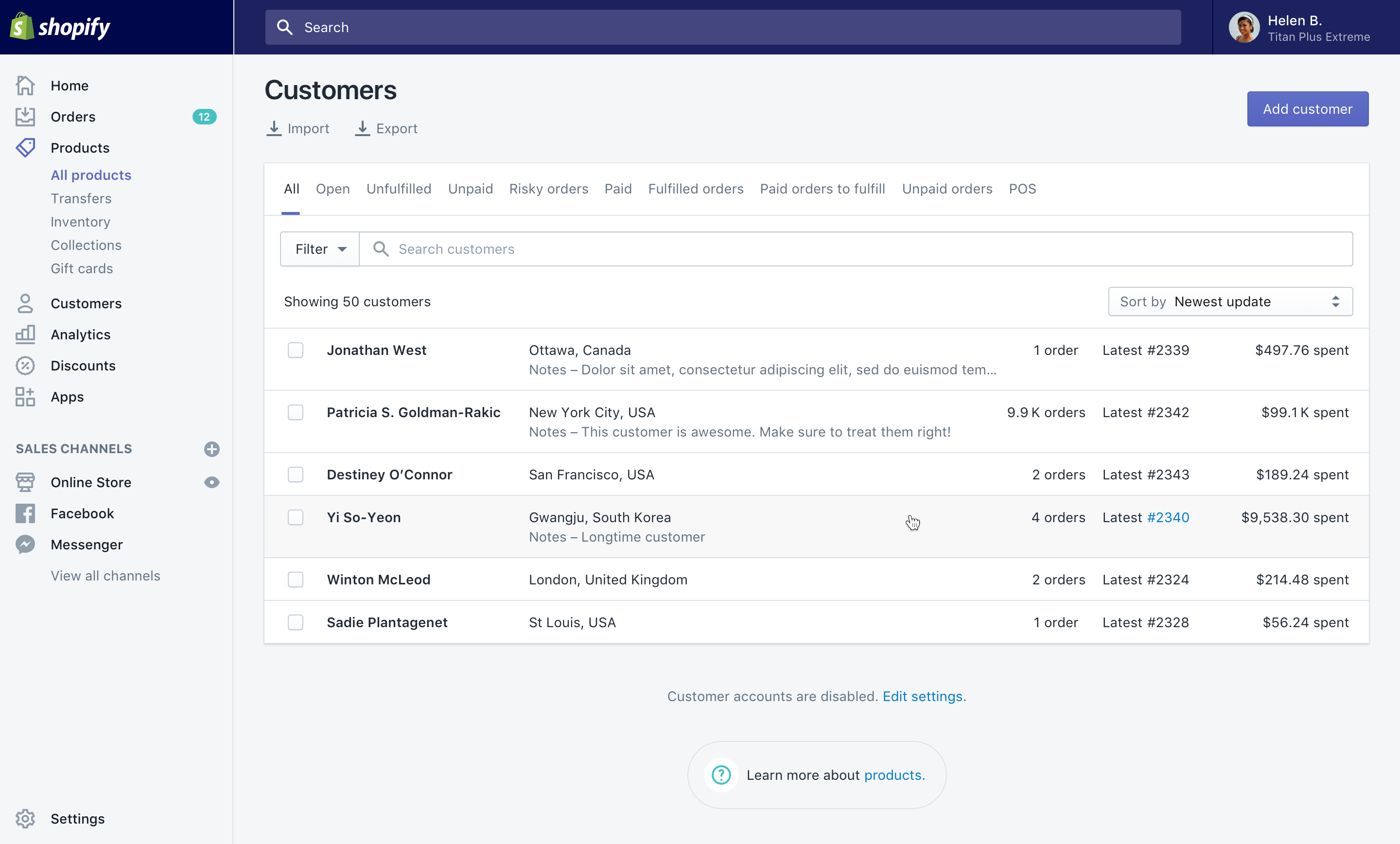
Use this layout for wide list or table views that benefit from more horizontal space.
- Set the page component to full width
- Use one or more basic layout sections
Example<Page fullWidth title="Single column wide layout">
  <Layout>
    <Layout.Section>{/* Page-level banners */}</Layout.Section>
    <Layout.Section>{/* Wide page content */}</Layout.Section>
    <Layout.Section>{/* Page footer content */}</Layout.Section>
  </Layout>
</Page>
Single column, narrow
Use this layout to focus merchant attention on a screen dedicated to a single task, like filling out a form.
- Set the page component to single column (narrow) mode
- Use one or more basic layout sections
Example<Page singleColumn title="Single column narrow layout">
  <Layout>
    <Layout.Section>{/* Page-level banners */}</Layout.Section>
    <Layout.Section>{/* Narrow page content */}</Layout.Section>
  </Layout>
</Page>
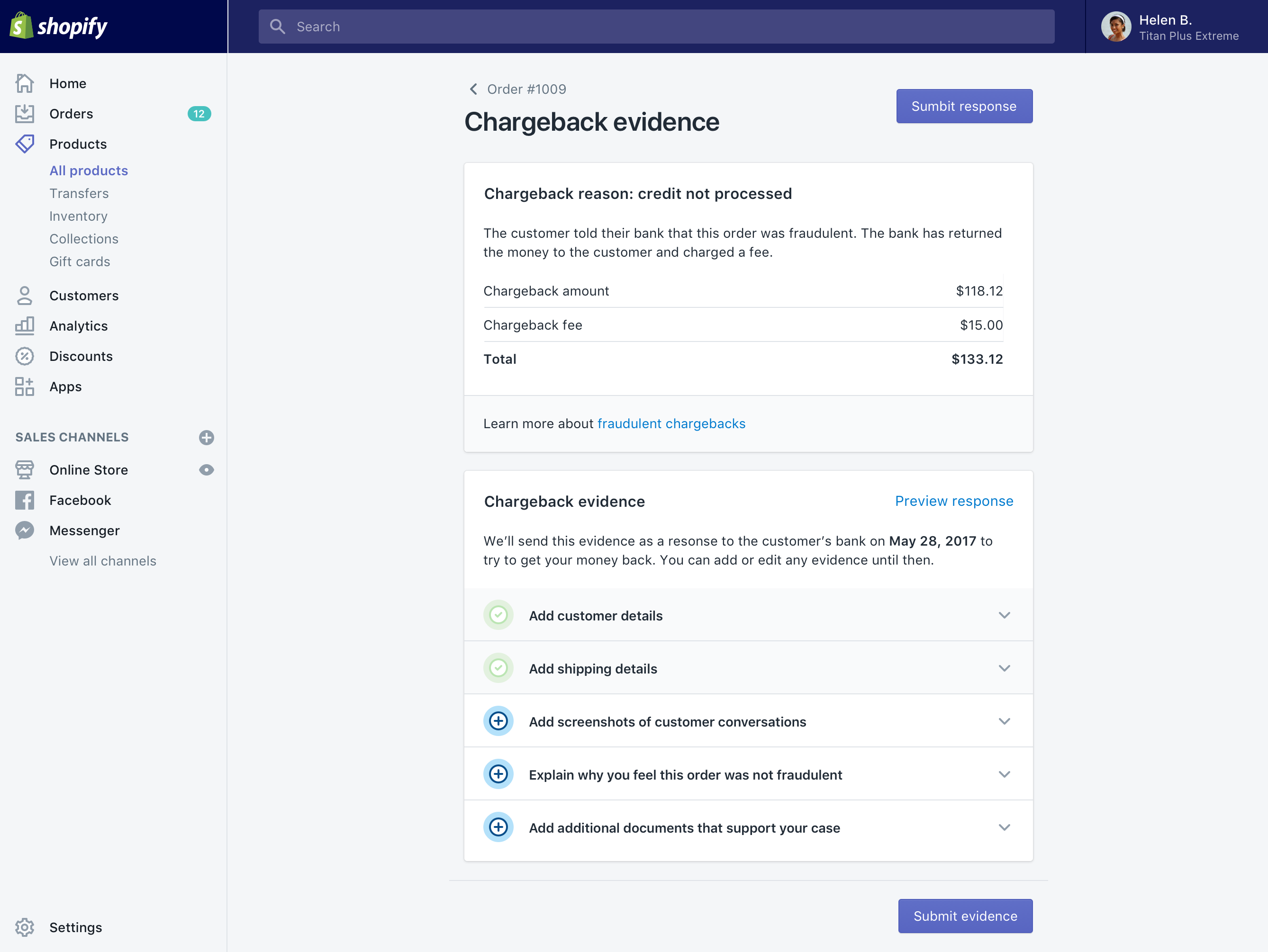
Primary/secondary
Primary/secondary layouts split content into a main column and a secondary one. The main column is usually on the left, but can be on the right.
The most common use of the primary/secondary layout is for showing the details for an individual object, such as an order or product.
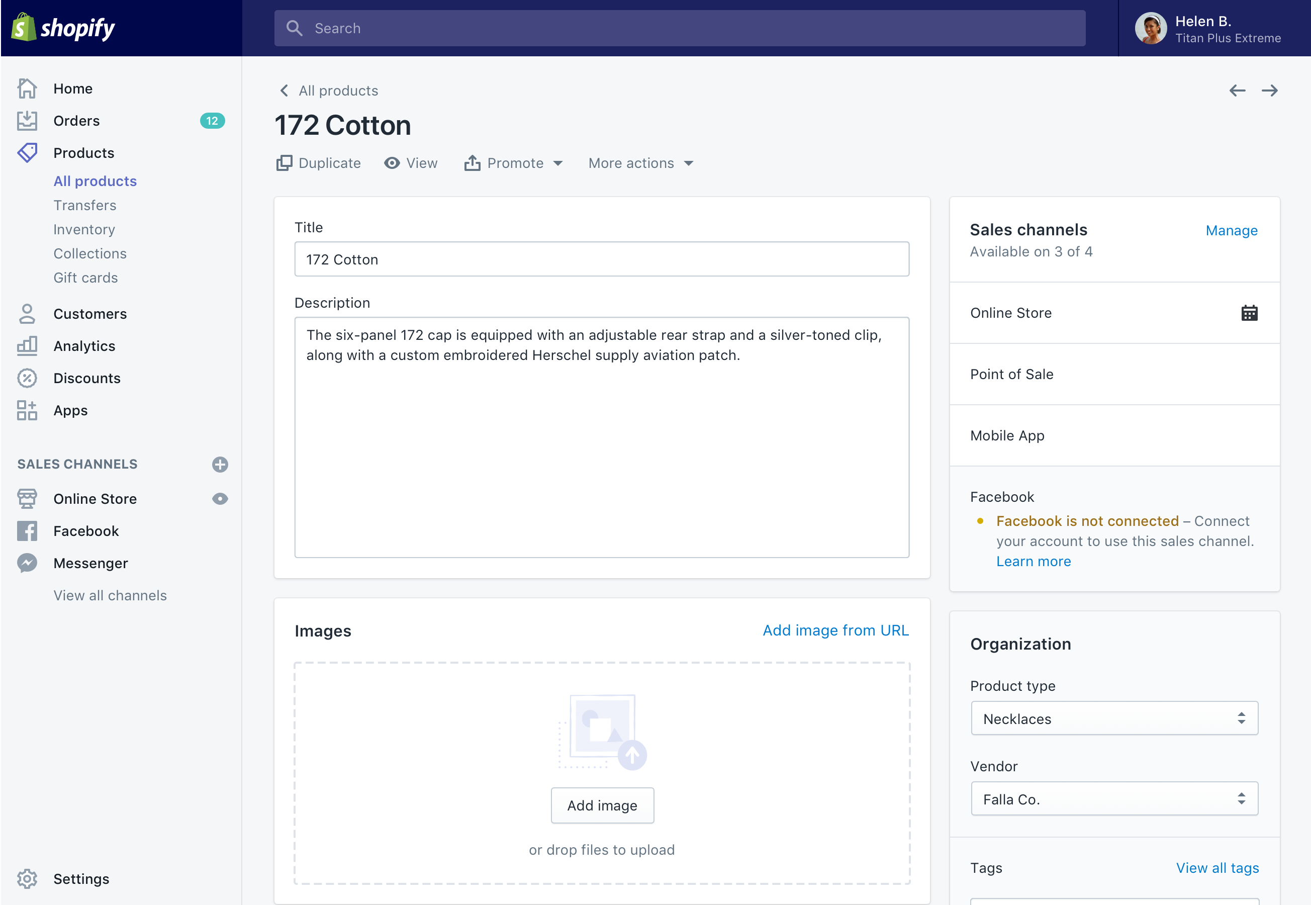
- Set the page component to its default width.
- Place the most important content in a primary column.
- Place other content in the secondary column. Content here should be navigational, less frequently used, or not essential.
Example<Page title="Details page">
  <Layout>
    <Layout.Section>{/* Page-level banners */}</Layout.Section>
    <Layout.Section>{/* Primary content */}</Layout.Section>
    <Layout.Section secondary>{/* Secondary content */}</Layout.Section>
    <Layout.Section>{/* Page actions (delete and save) */}</Layout.Section>
  </Layout>
</Page>
Another use of this layout is for a focused task where a summary is helpful, such as purchasing shipping labels for an order.
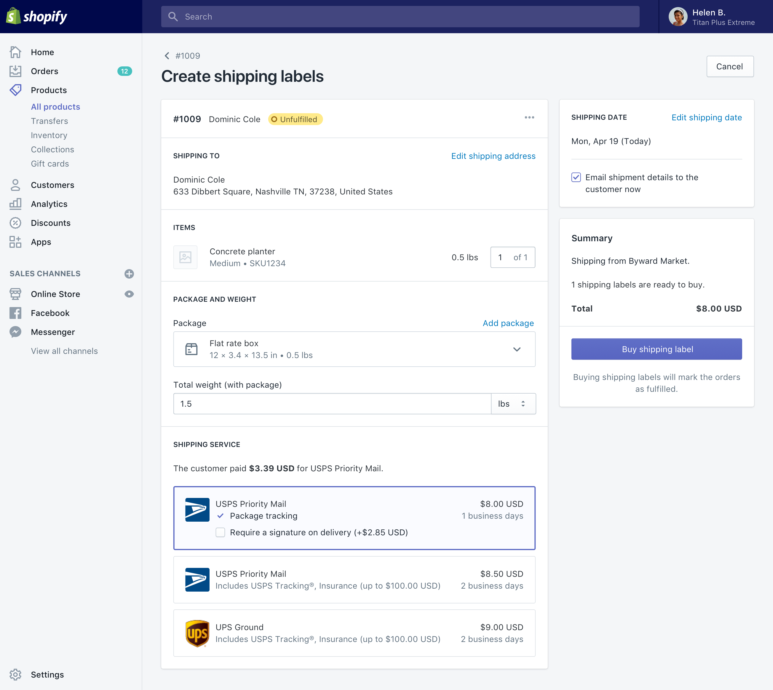
- Set the page component to its default width
- Place the primary column on the left to hold the main UI
- Place the secondary column on the right to hold the summary and call to action
Example<Page title="Task screen with summary">
  <Layout>
    <Layout.Section>{/* UI to complete the task */}</Layout.Section>
    <Layout.Section secondary>
      {/* Summary and call to action */}
    </Layout.Section>
  </Layout>
</Page>
Annotated
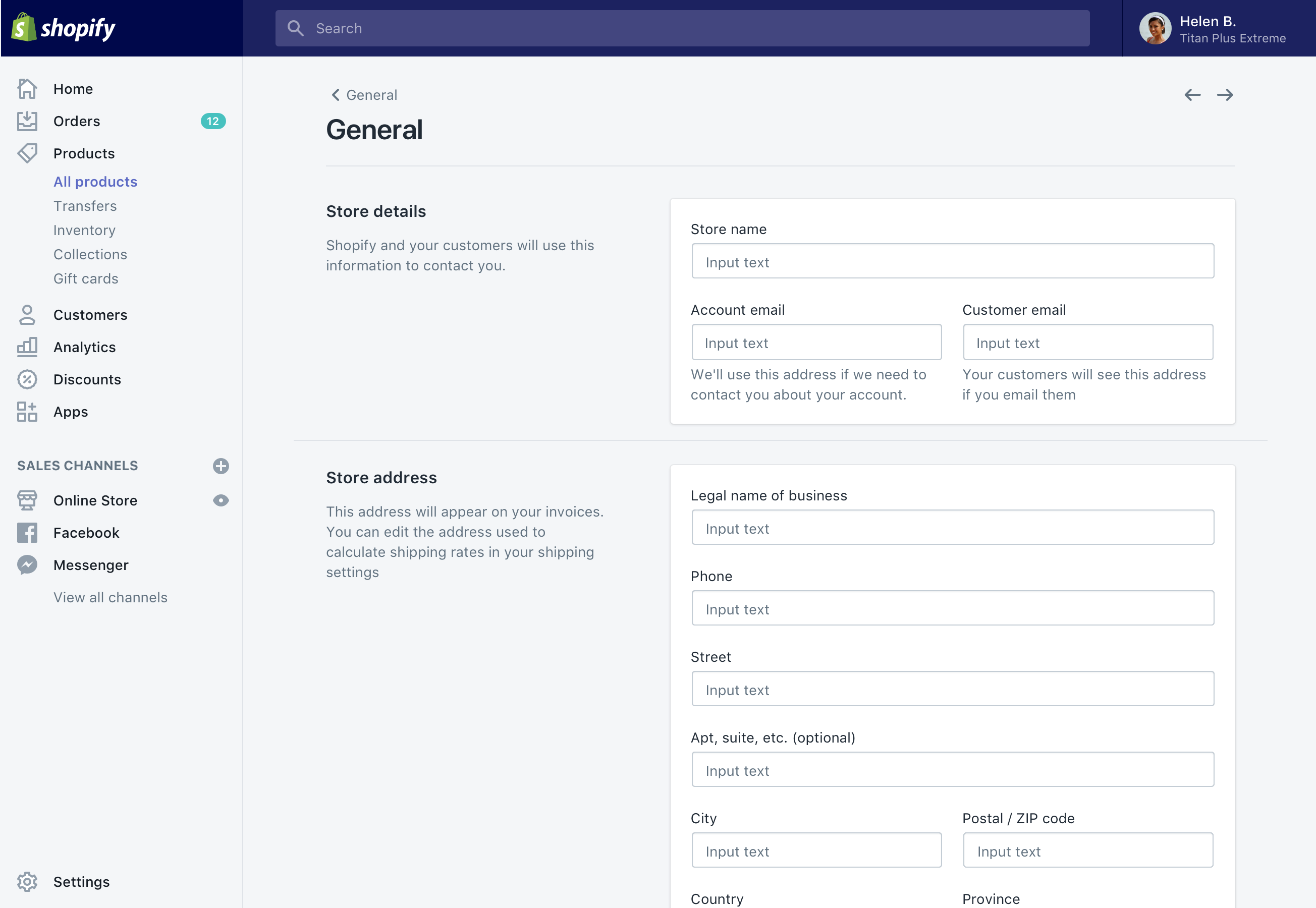
Annotated layouts group the content of the page into distinct sections that are only loosely related. This layout makes it easier to scan the page for a particular section.
Use this layout for settings screens. Don’t use this layout when merchants need to navigate to more than one section to complete their task.
- Set the page component to its default width.
- Use an annotated layout section for each independent topic on the page.
- Avoid combining annotated layouts with other layout types.
Example<Page title="Annotated layout">
  <Layout>
    <Layout.AnnotatedSection
      title="Store details"
      description="Shopify and your customers will use this information to contact you."
    >
      {/* Details fields */}
    </Layout.AnnotatedSection>
    <Layout.AnnotatedSection
      title="Store address"
      description="This address will appear on your invoices."
    >
      {/* Address fields */}
    </Layout.AnnotatedSection>
  </Layout>
</Page>
Custom page layouts
Most screens in the Shopify admin use one of these layouts, but they aren’t the only ones you can use in Polaris. The following layouts are also possible:
- Multi-column list
- Grid of equals
- Masonry layout
To achieve these and other layouts, create one or more custom layout components. Think of layout components a set of “shelves” into which other components can be placed.
Small-scale layout
The stack component is useful for small-scale layout. It lets you arrange arbitrary components in a horizontal row or vertical stack. It’s also a useful component for applying standard spacing.

Stacks work especially well for a row of components where one item needs to grow to fill the available space. When space becomes constrained, the content will wrap by default.
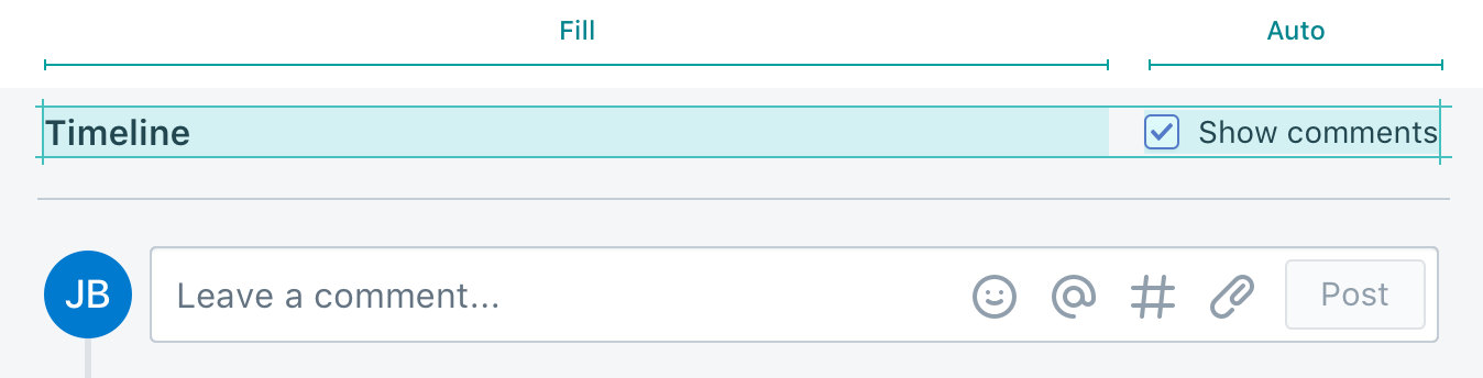
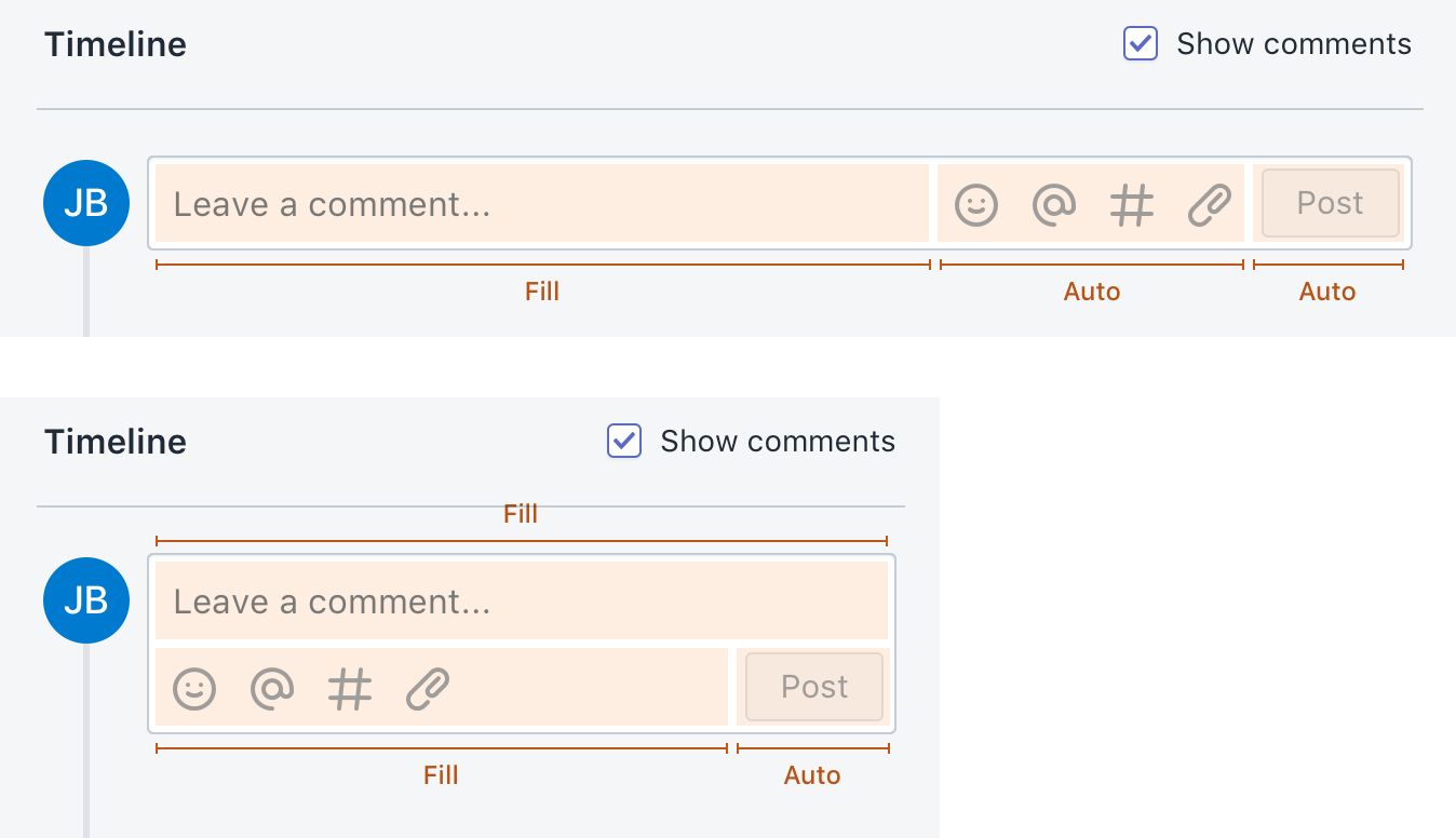
Custom small-scale layouts
You’re more likely to need a custom small-scale layout than a custom page layout. If the desired layout can’t be easily achieved using a single stack component, create a custom layout.
Custom small-scale layouts can often be done as part of a functional component, such as the timeline input shown here. It’s also possible to create dedicated small-scale layout components if the layout needs to be reusable.
Placing actions on screen
Organizing actions is as important as organizing content.
If an action applies to the entire page:
- Place it in the page header as a primary or secondary action
- Use the page actions component for page-level delete and save actions
If an action applies to something more specific, place it at the level of the content it affects. For example, if an action applies to the contents of a card:
- Use card header actions for less important actions, or those that don’t benefit from reviewing the contents of the card. For example, merchants may want to add items to a card containing a long list.
- Use card footer actions for a card’s most important actions, or actions that benefit from reviewing the contents of the card. For example, merchants should review the contents of a shipment before cancelling or adding tracking information.
Combining navigation with layout
Always consider the full range of screen sizes when designing layouts.
If a page has become complex, overloaded with content, or hard to navigate by scrolling on a phone, it can be broken up into a core page and secondary pages accessible via navigation.